


Project Overview
Unsplash has evolved into a major industry leading a photography community. The website has become a source of inspiration for photographers and non. As a student, I’m often looking out for opportunities to gain some experience in conceptualizing and designing applications end-to-end. In this project, I challenged myself to conduct a concept design for Unsplash. Included are a new design logo, website and Mobile app design.
Project Role
UX/UI designer, Graphic designer, Web designer, prototyping, Visual design & testing,
Tools & Durations
Adobe XD, Photoshop, InVision Studio, Sketch
May - June, 2019
DESIGN PROCESS
The overall process went over the course of three distinctive parts. First I focused on the logo design and decided to redesign the existing Unspalsh logo in order to reinvent the style in a way I saw as more meaningful. Continuing on, the second part consisted of the website design, I chose to design a concept website for Unsplash.com. My goal for the website design was to improved browsing experience and allow the users to navigate and find more information quickly and efficiently. The final step in the process was the mobile app redesign. Currently the Unsplash mobile app uses a clean and simple interface, yet for the redesign I mainly focused on enhancing the user experience to push the Unsplash mobile app into a new level.

PROJECT GOAL
1. Design a new logo for Unsplash and give it a fresh look.
2. Create a concept design for Unsplash website in order to improve browsing experience which will allow the users to navigate and find information quickly and efficiently.
3 Improved user experience with current mobile app that matches the utility and efficiency goal.
4 Redesign mobile app interface, in doing so users are able to quick search and save their favorite photos.
3 Better interaction for mobile app , if possible add some micro-interactions.
CHALLENGE
1. Inspiration
I’m in the process of learning more skills within the design process during this project. Redesigning a logo requires lots of research and inspiration on my part. For example, it requires the designer to consider the logotype and the logomark. Sometimes though it is hard to find an identity that worked perfect for Unsplash. Finding the inspiration mark was an unwavering process though.
2. Think Different
This project goes over three distinct parts in the process: Logo, Website, Mobile app. Each part includes unique process and different design thinking. Sometime it was hard for me to switch between the different tasks. I found myself wanting to give reasonable time frames for each, so it was challenging keeping a schedule with each task
3. Comprehensive ability
This is a new experience for me to combine my graphic design skill and UX/UI skill together for one project. This is a test of a designer’s comprehensive ability. Overall, this was a great learning experience a I gained more skills, though some were put to the test.
Part 1
LOGO

The original Unsplash logo was a generic camera icon displayed on the website, for users to associate with. It‘s deemed to be more generic because is has a direct relationship to the photography website. The current logo is simple, elegant, and distinctive but it lacks individuality. For the new logo, I want to combine the old logo style and current logo style, in order to make is succinct and generous. The new design is more descriptive, straying away from the minimalist nature, giving more symbols of unity, the circle, promoting an inclusive community.
SKETCH


The challenge for the redesign was that their symbol, when separated from the Unsplash brand name, was indistinguishable from any other generic camera icon. A core function of a logo is to be distinctive, all the while humbly sitting in the background of all the great work displayed. Unsplash is an honorable business practice, and the logo should not be confused or seemingly invisible for the brand.
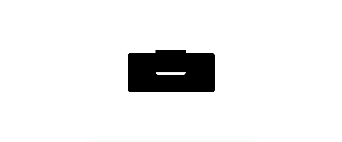
NEW LOGO

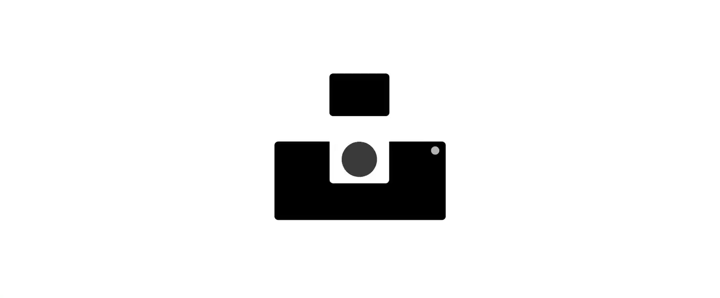

Simple and distinctive
A core function of a logo is to be simple and distinctive. The original logo was a minimalist take on a camera, and could be seen however you want to see it. For the new logo, I combined both and make it simple in understanding and distinictive..

Inclusive community
On the one hand, the rounded corner design is for the sake of beauty and simplicity. On the other hand, the round design can represent inclusivity and diversity. Unsplash is a community for people with a mutual understanding and tolerance of each other. I believe using the round design is a perfect choice for the new logo.

Part 2
WEBSITE
Unsplash website has evolved into an industry leading the photography community. It has become a source of inspiration for many people wether photographers or not, amateurs and experts all alike. More than 50,000 incredible photographers in the community are on unsplash. The second part of my project is creating a concept Unsplash website. My goal is improving the overall browsing experience, which will allow the users to navigate and find information quickly and efficiently.

THE CURRENT EXPERIENCE
The website is a major channel for people to find the best photography and for photographers to upload their projects. However, the current website has severe usability problems that make it challenging for visitors to achieve their tasks quickly and accurately. Some major usability issues were:
Disorganized and overwhelming content
Confusing IA and navigation
Redundancy content such as search bar etc.
Unclear user interface.

GOAL FOR CONCEPT REDESIGN
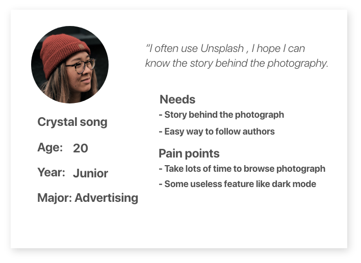
I interviewed a few photography major students to determine the goals for the redesign. I made sure to view the problem holistically and addressed three different types of goals: usability, simplicity and utility.
USABILITY
Improved browsing experience will allow the users to navigate and find information quickly and efficiently.
SIMPLICITY
Simplified the user interface, to provide the user with a simple and easy way to browse photographs.
UTILITY
Improved overall utility, removing redundant content. This is important to create a concise experience
IDENTIFYING USABILITY ISSUES
I used heuristic evaluation, interviews and card sorting methods to uncover major usability issues of the website and fix them to align with users’ expectations. The research helped me understand user behavior on the website and organize information in a way that makes the most sense to the users.
OVERWHELMING CONTENT
The whole page content endless photography which increases user’s cognitive load and makes it challenging for them to consume information and take the next action, such as find the best photography.
UNCLEAR NAVIGATION
Unclear navigation and information architecture make the users feel lost, and they don’t know where to proceed. Categorization of content is unintuitive and disorganized.
REDUDANCY CONTENT
The website has some redundant content. For example, two search bars in the main page, two wallpapers link which is redundant to use and make the whole website overwhelming and unclear to navigate.

Based on research findings, I need to simplify and reorganize the navigation structure so that the users can find the content intuitively and effortlessly. Also, I create a new way to flip the page browsing the photography instead of browsing vertically. I constructed a simpler IA by decreasing the navigation categories from 18 to 6.
Old IA

NEW IA

WIREFRAME
I started creating low-fi concepts based on my user research. I kept in mind that the main issue I need to solve for the website, once I had confidence in the design, I began digitalizing designs.

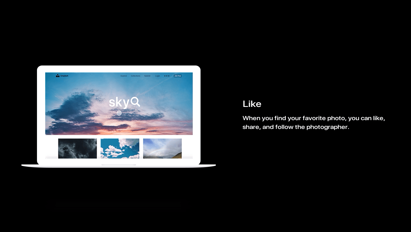
FINAL DESIGN

HOME PAGE
The home page has a minimalist design. The square card design style makes this interface simple and generous. Eliminate complex features to make the page as a whole clearer and easier to use.


Part 3
MOBILE APP
Photos for everyone
For the mobile app, my design goal is re-planning the functional architecture, simplified the user Interface, adding shortcut for user to direct download the photograph, making it easy to set photos on wallpaper. And finishing to create a design with more quality, a simpler view, more convenient design, for the younger mobile client.

The current experience
The current experience for the Unsplash app is alright, however I believe I can improve the app and make it more useful and increase the overall experience and usability for user. I believe this app is not only designed for professionals, but also needs to be user friendly for average users. The app should not only appeal to the professional community, but all interested in photographs, even those who just want find some great photos to use, such as wallpapers.

Qualitative Interviews
Understanding user needs
User research was quintessential within the process of the project. The complex workflows of the multiple user types and their interactions with one another needed to be laid out in a more detailed manner. In order to achieve that, I gathered as much as I could from the end users to understand the challenges they face and how they see the app making a difference in optimizing pain areas.


Personal Development
Goals for redesign
The overall design goal is still based on three basic design principles: Utility, Simplicity and Usability. For the mobile app design, I mainly focused on utility, the original app consists of a simpler design, but lacks usefulness.
Utility
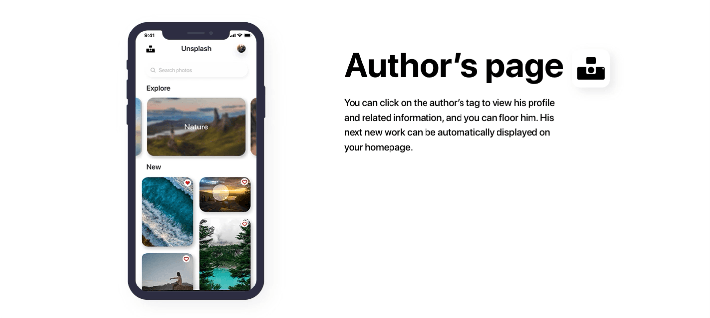
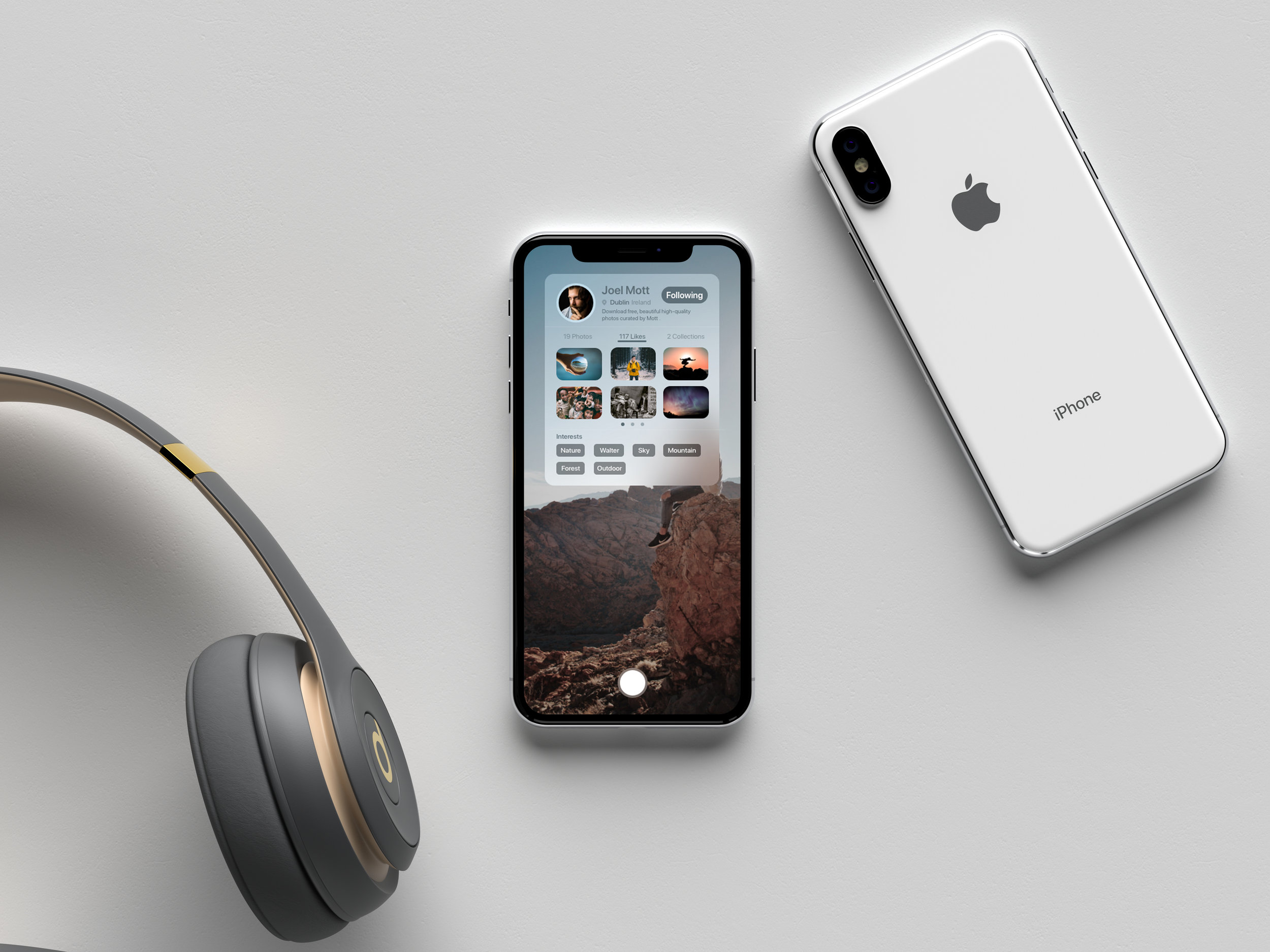
Improved utility by adding quick shortcuts for users to download photographs and view author’s info.
Simplicity
Keep a simple and clean interface by redesigning the main interface for users to better explore the photographs.
Usability
Improved user experiences will allow the users to navigate and find information quickly and efficiently.
Ideation
Brainstorm
I started brainstorming some ideas about the redesign and creating the information architecture for the mobile app. I used various brainstorming maps to categorize my ideas and contemplate what I wanted to achieve. I had confidence in the design, and began digitalizing designs.


Wireframe
Conceptualization
I started creating a low-fi prototype for the mobile app in order to see whether or not it would achieve my overall design goal. I redesigned the new login page and the main interface, not only keeping the simple interface but also focusing on improving usability.


Final solution
Visual Design
The solution I created succeeds in its goal of improving usability and utility. I simplified the user interface and preview user the most important information. User will be able to explore the different category and view the new photograph easy and fast.


Project renderings


Reflection
Taking on this project was a great exercise in self-led work. I was able to set deadlines for myself and make sure that I was using a workflow that felt appropriate and justified. My time management skills were tested during this project, and I was glad to improve on them.
I’m happy with the way I was able to distill the experience of a flexible interval timer into a straightforward and accessible product. I’m also satisfied with the visual design of the piece, I felt proud of this project. I gained so much feedback through talking to users in order to achieve the final design.
During the project I learned about the importance of building a great design system that works well for visual and user experience. The visual cohesiveness of this project surpasses much of my past work, and I credit this to a visual system that was more comprehensive and thought out than I had used previously.
Of course, there’s also a lot that could be improved in the future. There wasn’t enough in-person data collected during the design process—conducting a few more interviews and some user testing would help to better identify peoples’ needs and shed some light on any issues in the design. I also think that creating some user flows early on in the process might have helped me to avoid spending time fleshing out a long on-boarding process when something much shorter was warranted.
Conclusion
Ultimately, I’m happy with the product I created, especially the logo and mobile app. I think that I successfully achieved my design goal that makes it easier for users to interact with the Unsplash product. As well, I integrated some shootouts features for the mobile app without going overboard. After a bit of user testing, I’m confident that Unspash mobile app would have a satisfying experience for users. Overall, this project served as a great learning experience and aided me in becoming a stronger designer.