


Project overview
Nowadays, systems are rarely designed with the needs of people with disabilities in mind. In fact, it’s fairly common that users who are blind or physically disabled are unable to use some applications. In this project, I led a design team to help OurAbiliy Inc design a visual Chatbot for disabled people in order to provide them a better experience for their job looking.
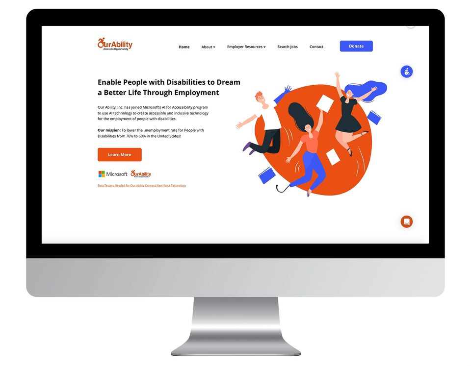
Client: Our Ability Inc. is a company that uses the latest AI technology to create accessible and inclusive technology for the employment of people with disabilities. The company enables people with disabilities to Dream a Better Life Through Employment.
Project Role
Lead UX Designer, Information Architecture, sketching, prototyping, Visual design & testing, project management.
Tools
Adobe XD, Photoshop, Figma,
Team
Kevin Camelo, Vicky Farinango, Aditi Agrawal, Rohit Raghunath Patil, Ishan Samir Parekh, Aishwarya Nitin Pathak, Latefa Mahmoud
Challenge:
How can we provide the same opportunities to those with disabilities as those who are typically developing?
Digital accessibility is often thought of as a checklist. Do the colors used have enough contrast? Is the text size large enough? Can the site be read by a screen reader? Although these are important, they limit designers to narrow thoughts surrounding accessibility. As a result, an important question is left unanswered: how can we provide the same opportunities to those with disabilities as those who are typically developing? OurAbility Inc. challenged us to think how to provide better access to employment and come up with new ways to reach most audiences, regardless of disability.
Project Process

Empathize
What we want to achieve ? What kind of Chatbot we want to design ? What is the goal for this project ?
To make sure we achieve a great Chatbot design journey, we have decided three major goals that we want to focus on: Great user experience, intuitive design, and accessibility friendly .

Discover & Planing
Research about Chatbot ! Understand the requirement for the Chatbot design ?
Society often looks at disability as a problem that needs to be fixed. For our project, we decided to use the social model of disability as it focuses on removing the institutional barriers that deny access to fair employment. Traditional job-seeking practices involve curating a resume and getting in contact with the business. What if the job seeker has limited hand movement? A fully functional chatbot can be another hand to help the disabled job seeker get better a better job search experience. Before we dive into design, we want to analyze the different chatbots on the market and get some insight into chatbot design.
Competitive Analysis
To start with the project, the first task we need to do is the competitive analysis of the existing chatbot on market, this step will inspire us for future ideation. Specifically, we want to get more understanding about accessibility chatbot on the market.
Question: What is Chatbot ? How do competitors design for ability?
Before we study for chatbot, the first thing we do is understand what is Chatbot. A chatbot is a domain-specific text-based conversational interface that supports users with a limited set of tasks. Next, we start analysis some chatbot on the current market.


Analysis insight
1 Most chatbot has clear purpose
We discovered that most chatbot has the clear purpose in the website or app. For example, the UPS bot is helping users find the tracking number or answering packaging related to questions. We believer it’s important to frame the chatbot purpose. Why user need a Chatbot ? What function should chatbot have ? This led us to think more for the ideation.

NYTime Chatbot provide customer the latest News, article. Spotify provide users the music relate support for better user experience.

Food Network created a Facebook Messenger bot that provides customer service support and offers answers to FAQs through categorized options.
2 Some job chatbot only allow users to choose the option answer.
We analyzed some job chatbots and found out some job chat only allowed users to select the preset option. It won’t allow users to enter any message. This is not a good user experience, which means users need to follow the preset user flow, and the chatbot cannot handle the error message.

Talkpush Job Chatbot only provide option for user to input.

TARS Chabot designed the input box, but only allow users to choose the option answer.
4 Most of Chatbot can not handle the Misunderstandings
The most challenging part of designing a chatbot is how to solve the misunderstanding. We realize that not lots of Chatbot can handle errors correctly. Many chatbots use advanced NLP (Natural Language Processing) in the background, while others are based on a simple decision tree logic. The Chatbot will keep asking users to provide the answer they can handle. Chatbot technology is not yet capable of understanding every user’s response well enough in order to reply in a meaningful way—no matter how perfectly the script is written, under challenging situations, it will most likely fail.
Having a creative solution is one of the most important things we should do. We must design multiple scenarios to test in order to make sure the Chatbot can handle the error correctly.

Paradox job Chatbot must allow user to input their first and second name. If user don’t do it, the system will repeat the word over and over again.

Fynd Messenger chatbot designers created multiple fail responses to avoid sounding like a broken record.
Research & Ideation
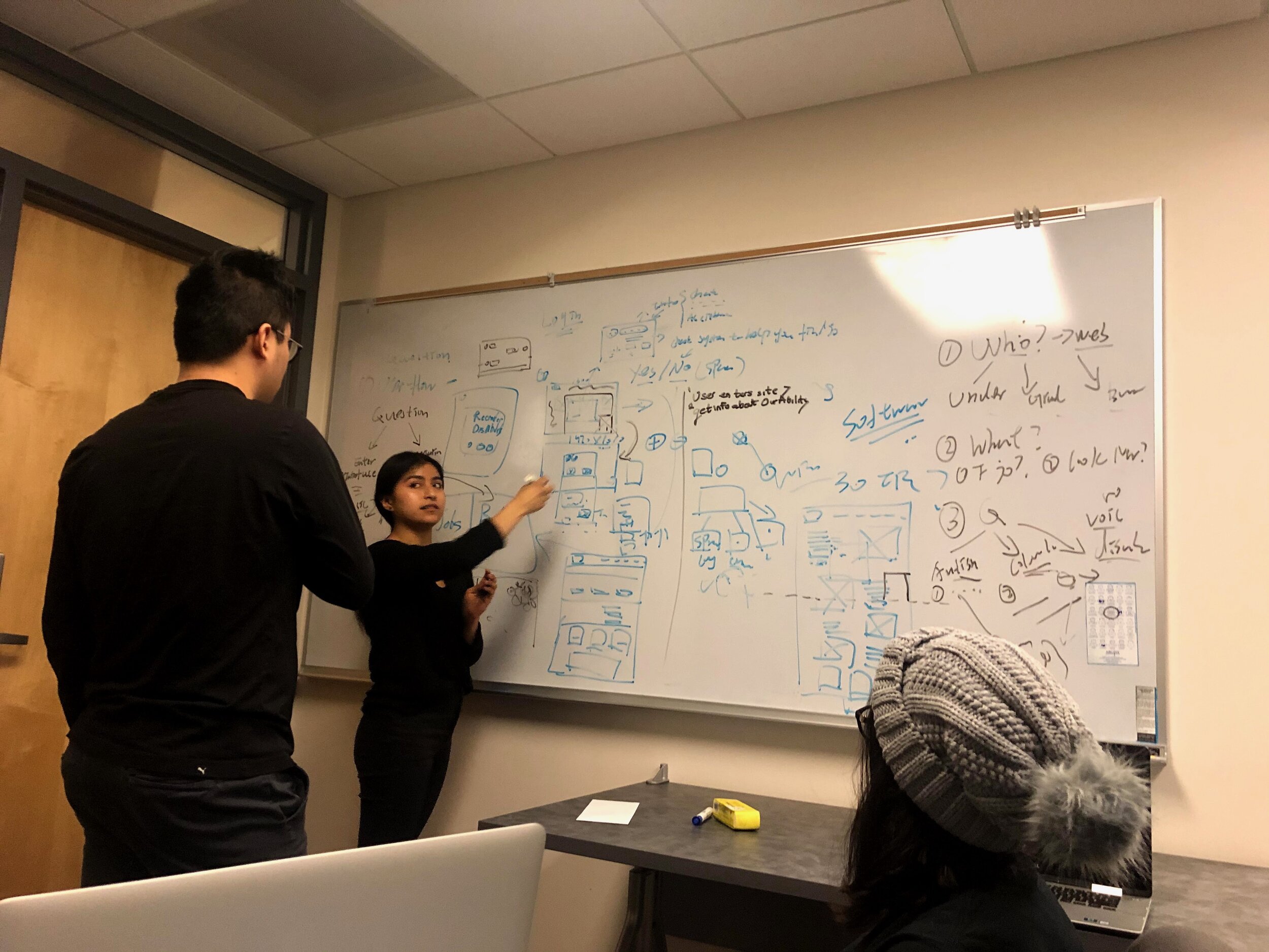
Kickoff meeting & Brainstorming
After previous discovery, we are confident to dig into this project. To kick the project off, a group of ideation and brainstorming exercises with the design and product team, as well as key stakeholders, were planned and facilitated. The goal of this session was to reinforce alignment with the core team on the goals of the project and the problem we solve, discuss existing research and assumptions and evaluate the existing product ecosystem as a base for the project.

Mindmap
We believe the mind mapping will help us better analyze and synthesize the information and ideas generated during the group ideation session. We have developed some great design and research ideas during the ideation, and a mind-mapping exercise helped to move this process along and provide a framework for visualizing the system and high-level approach.

Interview & Conversation
We want to know the user’s previous experience with Chatbot, so we conduct six interviews to get more insight into how users think about the Chatbot.

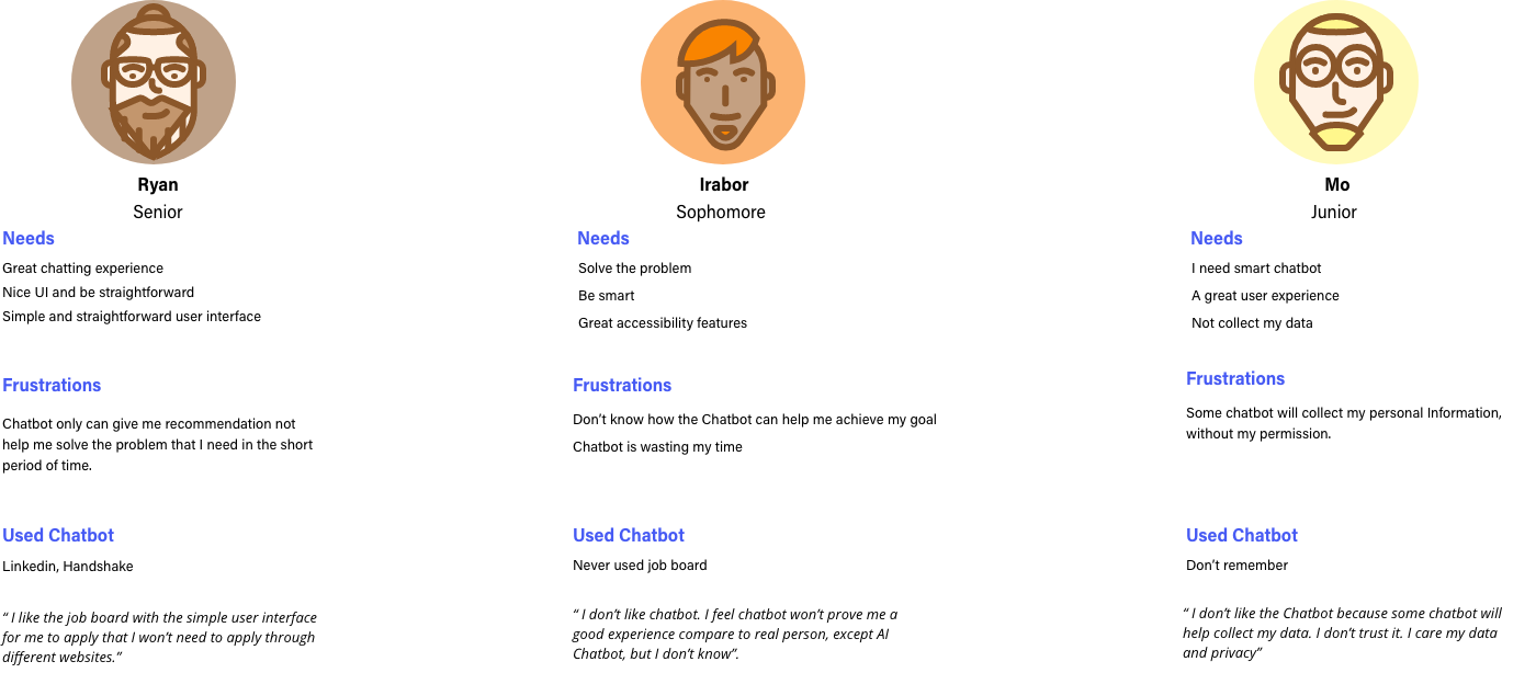
Key Takeaways
1 Participants don’t believe Chatbot will provide them a great user experience.
We found out most participants don’t think Chatbot is good enough to help them solve a problem through our interview. People believe Chatbot only can provide some information, not for help. We realized building trust is essential. People don’t trust Chatbot.
2 Most participants believe Chatbot is not smart enough to help
Almost all the participants told us one of the most important reasons they don’t use Chatbot is an intelligent problem. Yes, we understand the concern. The good news about OurAbilty is they have their own AI technology. We believe that we are confident to provide users a great experience.
3 Data security and privacy is something we need more discussion.
Some participants mentioned the data security and privacy issues that bought us attention. Yes, we need to take more time to think about it and work closely with engineers to make sure data are safe and secure.
Cognitive Walkthrough: Understand Attitudes / Tone Toward Bots
What is user’s attitudes toward bots ?
Using the mind map previously developed, our reattach team decided to make an idea of conversation flows for the chatbot. At this stage, message types were purely directional, consisting of message ‘type’ and supporting content direction that could provide clarity and contest for a given situation.
To better understand how users react for Chatbot and their perspective about the Chatbot, we conducted a cognitive walkthrough to found out what some insight about user experience.
The cognitive walkthrough is a usability evaluation method in which one or more evaluators work through a series of tasks and ask a set of questions from the user's perspective. The focus of cognitive walkthrough is to understand the system's learnability for new or infrequent users. A cognitive walkthrough begins by defining the task or tasks that the user would be expected to carry out.
We asked our 6 participants to experience three different Chabot: UPS, Paradox, and Google Assistant. We divided into three groups, two for each group, to see how they react for these three chatbots. We also provide them the scenario for each Chatbot. We want to understand how users' attitudes toward the bot, whether they are satisfied and not, and understand what is wrong if they are not able to have a conversation with Chatbot.
Deep Analysis
We analyzed the three scenarios separately to help us better understand the user’s emotional change.
Sensorial1 : UPS Chatbot
The first Sensorial is about missing packages, which require participants to use Chatbot for help. We observed how they react to the Chatbot, and through their performance, we created a Chart to show how their attitude change toward the Chatbot. We got some great insight into how user users' attitudes toward the Chatbot, which helps us move forward.


The first chart represents how a participants attitude toward the UPS chatbot. The second chart represents how a user’s emotion change when talking to. Overall, the user’s attitude changes from neutral to negative when they experienced the missing package. However, we realize a user’s attitude toward Chatbot is base on their experience. When users had a negative experience before and began asking help, their attitude tended to be neutral and negative, which is a good explanation.
We also asked what other factors affect their attitude toward the Chatbot. People said “the Chatbot experience”. Most people are except the Chatbot provide the solution rather the just advice and suggestion. This is something we already discovered.
We found out UPS Chatbot like to provide user option not solution. Finally, another things we realize is when users talk to the virtual assistant, they like to use simple sentences to explain their situation, especially when the Chatbot did not answer their questions or meet their expectations.
Sensorial 2 : Paradox Job Chatbot
The second scenario is something we are mainly going to focus on: Job searching experience. We asked participants to experience Padadox job Chatbot and provide feedback for us. We created the two charts to reflect the user’s emotion and attitude toward the Chatbot. We found out users had high expectations of using Job Chatbot. They are hoping the Chatbot to help them get some job recommendations. However, we realize the Chatbot design and user experience are profoundly affect the user’s attitude and emotion. The participant said the Chatbot feel robotic, and require users to follow the preset flow, which is not a pleasant experience. Also, how can a Chatbot provide current informants for users just base on their name?
Through this walk flow, we understand some user’s expectations toward the Chatbot. We realize most of Chatbot did not analyze user’s job skills or necessary Information to provide user answers, which is bias and unreliable.


Sensorial 3 : Google Assistent
The third scenario is an experienced google assistant. We found out some smart assistants provide good user experience, such as Google Assistant. We believe that we can learn a lot from it.
During this scenario, we didn’t give any specific topic. We decided to let participants explore it by themselves and to gather their attitude and feedback. The result was quite good. Participants like how GA responds to their question and feels like talking to the real human. Something we realize the difference between the GA and other Chatbot is the context processing.
The processing contest is defiantly challenging. Understand the intrigue of language is not easy. This definitely due to machine learning and massive data support. We understand our ability can’t achieve the high-level experience initially, but we are confident to provide them with a good direction.


Key Takeaways
1 User’s attitude is highly affected by the Chatbot experience.
Through our research, we understand the user’s attitude is highly affected by the Chatbot experience. We believe a good user experience will keep the user, and a bad experience will lead users far away. Especially, we need to think about how to design the user flow and avoid robotically.
2 People tend to use a simple word to interact with the virtual assistant
We discovered when users realized the Chatbot sound robotic. They like to use a simple word to express the meaning because they believe this can help Chatbot better understand their meaning.
3 Use Emoji or spoken language to get close with users.
We found that Google Assistant uses lots of Emoji or human language to avoid the robotic language. We believe this is important for us to take advantage of it, especially for people with mental health problems. Simple and straightforward language is what we need.
4 For some Chabot, users must choose the option or follow the preset flow.
We believe the that we designed will be a revolutionary experience for OurAbility. Through Chatbot, users will get a better understanding of company culture and business goals. However, lots of Chatbot didn’t do well on the experience. For example, the Paradox job bot will keep asking users the same question when users decided not to follow the preset flow. This makes the user experience drop quickly.
Empathy Map
After some in-depth research analysis, we have learned a lot from different user’s perspectives toward Chabot. In order to better organize those informants, we made an empathy map to articulate what we know what a particular type of user. This will help us a better understanding of user needs and aid in decision making.

Conclusion:
Chatbot revolves around conversation. It’s hard to make users feel they talk to the real person. Users are generally aware that chatbot doesn’t have feelings, yet they prefer a bot’s repose to be warm and human, rather than cold and robotic.
Because we want to build an interaction bot rather than Customer-service bots, we believe the tone and attitudes toward bots are important. We must consider a real conversation between a customer and an agent. The agent is a human being who can continuously adapt their voice, body language, and vocabulary based on a customer’s behavior and responses. A bot, on the other hand, has predefined response patterns. It is important to remain conscious of how the tone may affect a user’s experience. In order for a chatbot to be well-received, we must consider how to give a Chatbot personality. This also an important ideation direction that we discovered.
Rapid prototyping of conversation / user flow
Using the empathy map previously developed, our research team decided to make an idea conversation flows for the chatbot. At this stage, message types were purely directional, consisting of message ‘type’ and supporting content direction that could provide clearly and contest for a give situation.


A dilemma
We had a problem when we design the user flow or conversation flow for the Chatbot. We realize it is hard to determine the Chatbot logic. It’s impossible to apply one flow to all people. For example, a user who has a computer science background, he or her need is different from another user who has different skills and background. This is hugely challenging for Chabot to determined what Information should provide to users. Through the research, we understand if the user’s logic doesn’t match the Chatbot logic, there is no way to make both things work together. We want to design the Chatbot logic to fit for specific users, which means different users based on their previous experience, educational background, skills, etc. will experience different logic flow to maximize their experience. Question: How do we do that?
Question: How might we design the Chatbot logic? How might we ask the right question for the right users? What if users don’t know their career intreated?
This is a challenging task for all of us. We were back to the original point. However, we didn’t just give up. We want to start with the user’s skills; skills are something we all carry on, including soft skills and hard skills. We believe skills are the essential connections between Employer and Employer, and our next step is to take a more profound analysis of the user’s Skill.
Learn about Skills
The first step we did is interview some users to understand what skills they have. We create brief interview questions to help us get better ideas about both users' soft and hard skills. After the interview, we start to organize the data and categorized each answer into a different category.


Key Takeaways
1 Identify user skills through adjectives and keywords.
We talked to lots of users about their skills. We realized users like to use a different level of the adjective world to express their skills. For example, some users said they like coding, some users said they know how to code, some users said they are professional for Java. Like, Know, professionals, are three different degrees of skill level. Through these keys words, we can know what skill users have and how good they are.
2 Lots of uses don’t have a clear career intreated or direction.
We asked lots of people do understand their career intreated. It seems like help people don’t know or unsure about their answers. So we start to form their soft skills to approach their career intreated.
3 It’s a long way to go.
We understand that it’s impossible to analyze all people’s skills and provide precise job recommendations. We believe this is a long way to go, but we will work closely with the engineering team to make sure we are on the same page.
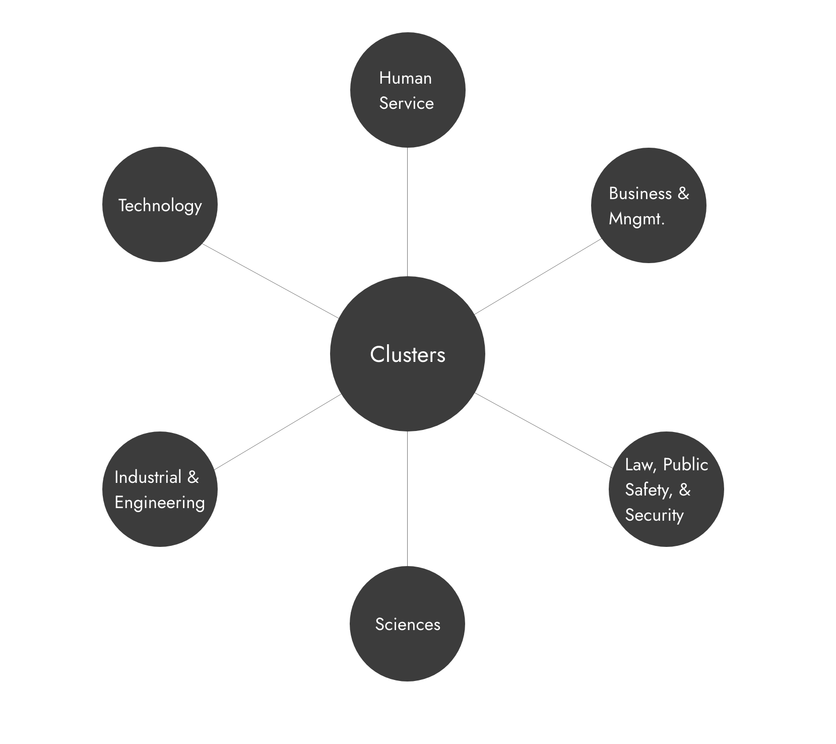
User flow Solution: Introducing Cluster
After some deep user research, our team has provided the best user flow solutions: Career Cluster. Initially, we planned to create job clusters based on the available jobs on the various job sites and combine similar jobs to form a cluster family. However, this process could involve a lot of discrepancies and would be very time-consuming. Through per research, and users skill interview we have decided to divided career into clusters ( initially 6, final14 in all). The virtual job Chatbot will help users pick from fourteen clusters and, eventually, show questions (as mentioned below) accordingly. Thus, we are trying to get users to answer a few questions belonging to clusters to identify their areas of interest. This is mainly for the two sets of users:
Who might not be sure of what career path they want to choose? For example, students right out of high school or who might have some other skills and do not know if they can opt as a career? For example, someone working as an assistant and has a hobby/skill in graphic design.
In Figure 1 below, we provide a look into how the chatbot will organize the relevant information gathered from the user. Industry categories were identified through extensive research and labeled as “clusters,” and include Human Service, Sciences, Business, and Technology, to name a few. Once a user identifies which cluster they would like to work in, the chatbot then prompts them for skills related to that cluster. In Figure 2, a simple example of the skills related to the Business & Management cluster is shown. After this process, the user is able to identify what kind of positions they are interested in within their industry cluster.

Base on the researched of the various skills required for each job cluster. We formulated questions that the chatbot could ask a user. After many deliberations and advice from one of our team members acquaintance, we concluded that considering the sensitiveness of the end-user population, the chatbot had to ask the most straightforward and user-friendly questions.

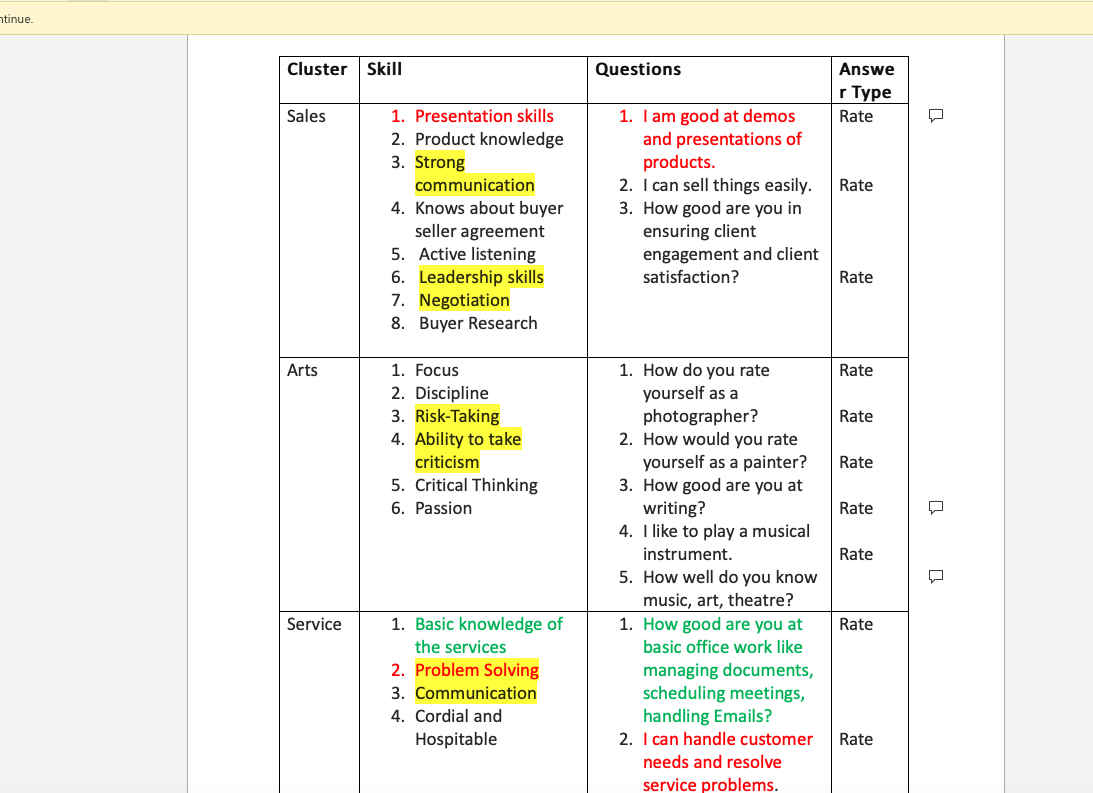
Therefore, the team worked towards formulating questions that were rating based. The rating was decided to be from 1 to 5 (Novice, Beginner, Amateur, Professional, Expert). These questions were formulated, keeping the end outcome in mind. Those are the questions needed to match the job role and vice versa. Post this stage. The team faced another dilemma with respect to how the job roles could be displayed with the current data points that we had. We simply needed more data in order to achieve the end output. After careful consideration, the team decided to reclassify the clusters according to a tree-based approach wherein all the skills will have at least one question attributed to them. This would enable the team to get more data from the questions and map the skillset with the desired job role displayed by the chatbot to the end-user at the end of the transaction. Similarly, the soft skills were also reclassified into a tree-based form with a parent soft skill having similar child soft skills. Questions pertaining to the soft skills were also formed in a rating-based format. Furthermore, in order to have a working algorithm for the chatbot to display job roles to a user based on the answers provided and the relevant educational background and work history of the user, the team came up with an LCM and minimum threshold-based approach in order to iron out outliers and balance a system in order to have an optimum solution.


Conclusion: To Be Continue…
Although, we had came up with the solution for conversation flow and logic, we still believe the solution can be better. Our research team will continue work closely with OurAbility team to provide the new research insight. We also expect more usability testing and feedback from users in oder to keep improving the solution.
Design
We started to think about design at the very beginning. Accessibility, User experience, color contrast, elements, those design elements always challenged us to think more than we could. The first thing we need to do is establish the design principles. We researched the accessibility design principle and combined with the current case conclude four primary design principle: Clarity, Learnability, Efficiency, and Consistency.
Establishing Design Principles

Experience Design
Brainstorming Design session
1 How might we enhance the chatbot experience? Can we do something different ?
How can we make this a good experience? How can we make sure that this is the perfect implementation for the website that we created? Through the previous research and competitive analysis, we found out most Chabot just pop up in a small window on the right side of the website, which is good. However, we also found out lots of users don’t like the small window conversation experience. Instead, we realized that people need to know that a chatbot is there to help them do something. In order to get some great inspiration, we decided to sketch some ideas and ran a brainstorming design session to see what we can come up with.


Design ideation 1
The first ideation from one of the team members is to design a specific session for users to log in using Chabot. If user need to use the chatbot, they need to register and login to a particular system. The system support split-screen to allow user view information and Chabot side by side. Multitasking is support


Pro:
With a consistent user interface, users will be able to use the Chabot in the full-screen mode. Users have more options to customize what they need.
Con:
Users need to log in to a system that will increase the user’s cognitive load. It’s kind redundancy with the current our ability connect feature. Not all users like to register to use a Chabot feature.
Design solution 2
The second solution is when users come to the website. The chatbot window will pop on the right. The screen will split half. Users will directly interact with Chabot and the main website content together.
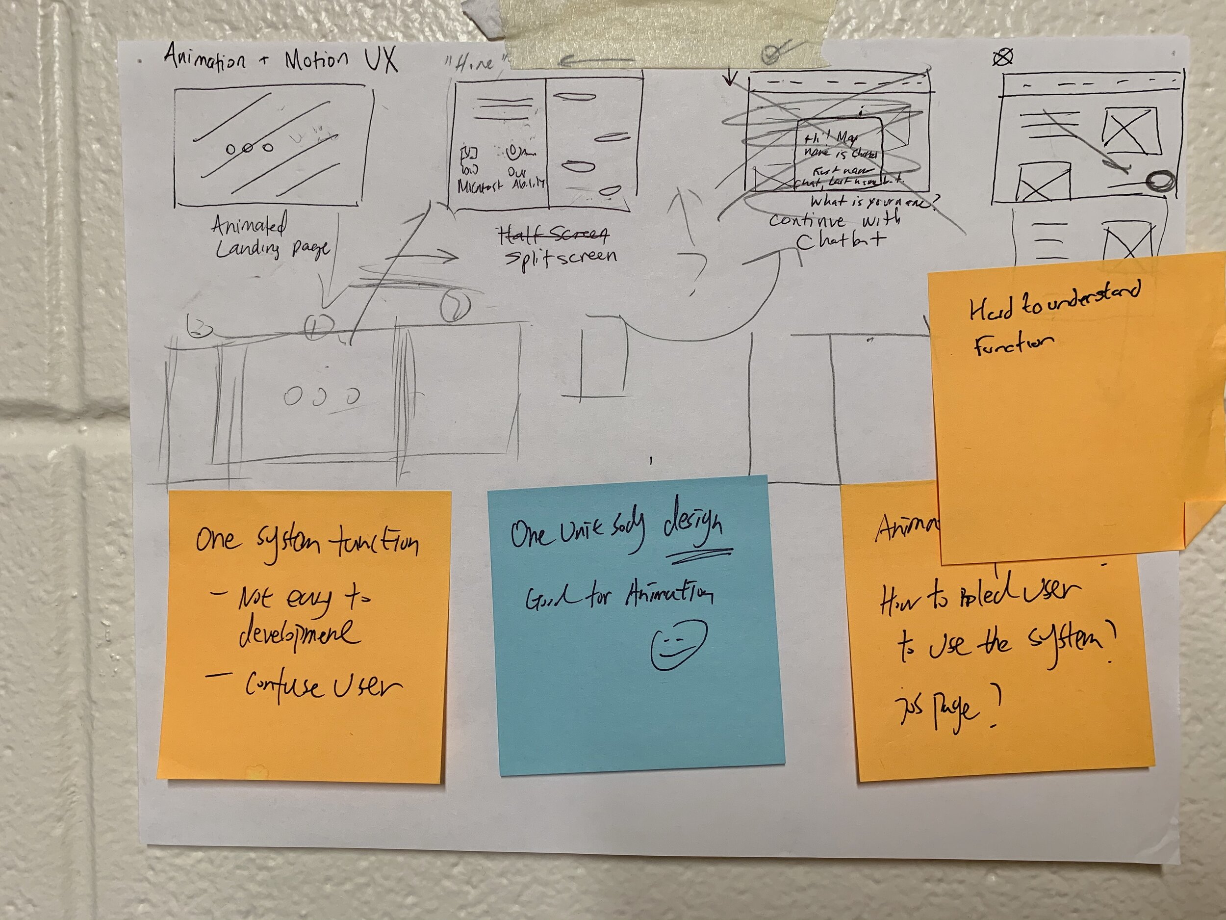

Pro:
Allow users to adjust the size of the user interface to better interact with Chabot. Multitasking support.
Con:
Not sure how the back end will support this solution. It’s wired for users to view the website for half screen size. Confuse users to use the website. The solution may not fit the business goal.
Key Takeaways
1 Need to find a BALANCE
The design sessions allowed us to brainstorm some great design ideas, but we believe we need to find a balance between the business goal and user experience. We had some good ideas, but it may not be the best idea.
2 Design for everyone and think different.
We always remind ourselves we are designing for everyone, which includes the disability community. We believe we should take more different user’s perspective to understand their experience.
Visual Design
We started to think about visual design to create some layout base on our brainstorming result. We take advantage of the new design system that we created from the web design project to refine some Chatbot details. We tested different layout, font size, and color style to understand the overall user experience.


Final Design

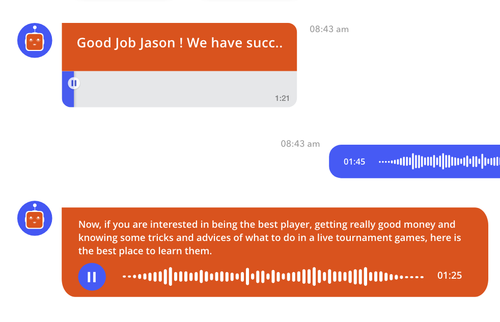
Hi ! I am Ovi!
In order to help user get a better experience, we named the OurAbility chatbot Ovi. Ovi’s friendly, human-centric, and designed to help our users with easy to understand inquiries. The question design helps reduce users’ cognitive load and understand the OurAbility platform without inducing the stress that traditional comes with a job search. The chatbot also follows the same accessible color contrast and design system that was established with our website redesign.


Prediction, empathy, and purpose
Ovi is meant to resemble a human, but he’s pretty handy when it comes to knowing what you’re looking for. Ovi is equipped with predictive text to speed up a user’s job search. This feature is implemented through predictive text bubbles which users can click to continue. Ovi aims to walk the user through employment with timed breaks, strategically designed to make sure that users have the headspace to continue their job application. As a result, Ovi is not only one of the easiest ways to find a job, but the most understanding of the stressful nature of the process that resonates with our target audiences.
Onboarding experience
After the design brainstorming session, we took what we learned to reimagined the chatbot experience. The onboarding experience is explicitly designed for user who is first time visit the website. Instead of an abrupt pop-up window on the right, we realized that people need to know that a chatbot is there to help them do something. We decided to build a chatbot onboarding page to help users understand the experience.
Customizable User Interface. Meet all your needs
Through user research, we understand some users don’t like to chat in the small window. So we came up with three different conversation sizes to assist users interacted with the Chabot. For example, Suppose users like to focus on the conversation with Chatbot. In that case, they can switch to the bigger interface to have a full immersion experience with Chabot, which also increased the accessibility experience. People who like to focus on website experience instead of having a conversation can minimum or turn off the chatbot windows. We want to make sure it works well, meet the accessibility need and business goal.


Content got blocked ? No Problem !
We realized sometime. The Chatbot will block the contents when the user is browsing the website. In order to view the blocked contents on the website, users need to turn off the Chabot. We understood this is a problem and designed a “ Move Bar ” to let users drag the Chatbot around when they have a content block situation.
Accessibility ! We care about the most.
Technology is most powerful when it empowers everyone. Accessibility is what we cared about in the experience. Every design decision we made include our unique thinking about availability. For example, We started using a simple design with color contrast to help individuals read the text, using the current orange and blue OurAbility colors to create a strong contrast. We also added features that help users use the chatbot. Users can quickly tap and use prediction words to go to the next step. When users right-click, they can quickly access some great accessibility features such as immerse reader, translate, etc.

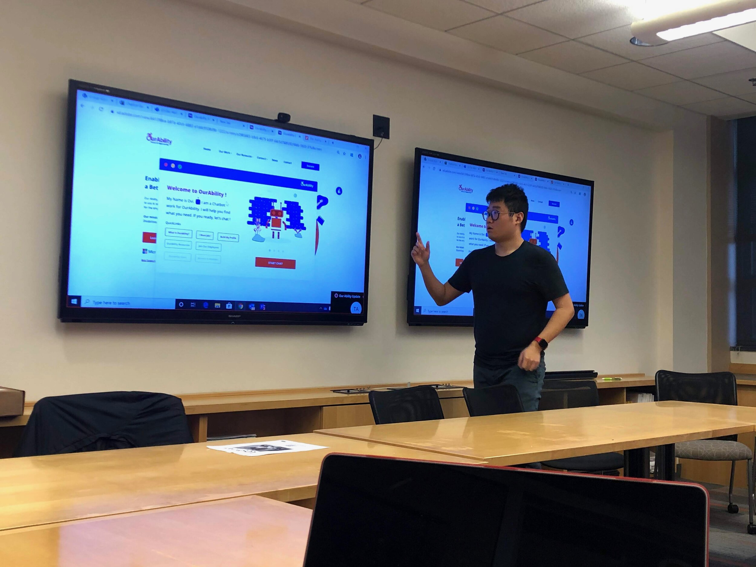
Usability test
To test our concept, we conducted a miniature version usability test. We recruited participants and encouraged them to “ think a loud” and speak up whatever comes to their mind using the prototype. From the overall test finding, it can be inferred that the prototype is a success, with respect to the accessibility guideline and on-boarding experience. It has helped unearth some issues in visual and readability. We got lots of valuable feedback from both business partners, stakeholders, and potential uses.
key User feedback:
1 Chatbot visual design can be better.
Some users don’t like the strong contrast with dark orange color background about the Chabot. They felt it is hard to read sometime, of course, the readability can be improved.
2 More accessibility features
Users expect more accessibility features being added in the Chatbot, such as the visual keyboard, etc.
3 Dark mode and color invert design.
We asked some people who have vision impairment to provide us some feedback about the design. Some users think the dark color text is better for better readability, and they are except to see the dark mode or color invert design for the Chatbot.
Iterate
After gathered some amazing feedback from users, we decided to take uses’ feedback to make some change and continue to improve the overall experience.
New incoming message animation
We redesign the Chatbot icon to better match the Chabot personality preset. When users get messages from the chatbot, they will get a nice animation to indicate the incoming message notification.
Pain point solved: Improved overall Chatbot experience. User friendly for people who have autism spectrum.

Redesigned Components and style
We received lots of feedback from the Chatbot design. We believe the design definitely can be better. We started from simple elements, such as components and corner radius, to refine the user interface. We tested different color backgrounds, text size, and line-height to find the best option and make everything more consistent and clear. Depth, shading, and translucency are how we create the hierarchy.


Dark mode / Invert color
We tested the situation when users enable dark mode or invert color to understand how the chatbot work for the night time and make sure all the design work well.


New quick reply and quick tools
The new quick reply allows users to preview the incoming message and make a fast action.
Pain Point solved: Improved overall texting experience. Reduce extra animation.
Through the tools bar, users can manage the font size, change the color contrast, or convert the conversation to PDF or Word format.


New Visual Keyboard
We add more accessibility tools to the Chabot, which takes the accessibility experience to the next level. The new visual keyboard is a customizable, onscreen keyboard that gives users limited mobility advanced typing and navigation capabilities. Users can choose different style base on their needs.


Scribble Support
We add scribbles to the chatbot to make the accessibility experiencer better. The scribbles is designed for users who use the mouse or other tool for their primary input device. We made scribbles panel as flexible as possible to allow users to split apart from Chatbot and customize its size.


Design for mental relief
Mental health is what we also care about the most. We want to do our best to support users who need mental support. We understand the Chabot will need to collect lots of information from users, increasing user’s mental stress. Some designed six different mental relief features to help users go through this experience.
We added a take breaks option in the prediction word to help users take a mental break. Users can make Chatbot play relaxing music, tell a joke, sing a song, or even a deep breath session. We designed a mental relief animation to help users take a quick 1-minute deep breath to relax their bodies and minds. We believe this is a great feature that is designed for everyone.


Improved Accessibility tool bar design
I also redesigned the accessibility toolbar to match with the Chabot design. I refined some detail of the user interface, such as corner radius, shadow to make the user interface more consistent than ever.


Future steps.
1 Iterate, test, iterate!
We believe iterate is the key. There is not the best solution for product design, but we can always make it better. This is definitely our next step, followed by more testing and iterations!
2 Work closely with the OurAbility Engineer team to make it happen.
We achieved some great accomplishments through this project. We still need to work closely with OurAbility engineer team to turn the great things to reality.
3 Think more about accessibility.
Although we designed lots of great accessibility feature helped the people who need it, we still want to make some features even better. It’s definitely hard to design and think about accessibility, but we always believe technology is most powerful when it empowers everyone. Never give up on thinking of accessibility.
Reflection
1 Stand from user's perspective to think about the problem.
As a product designer, I always get so many tricky problems that need to be solved. Finding the target users and stand on their position or perceptive is the key to find the solution. That's why we got close to the disability center to get the freshest feedback and idea on this unique project.
2 Balancing business and user needs is key to the feature's success.
The most challenging part that I learned from this project is learning how to balance the business and use needs. We always got lots of feedback from both users and business partners. That's doesn't mean we all have to listen to every single thing they said. We took lots of balance in between, to improve or change base on both business and users' needs.
2 Teamwork is important! We all have something to learn from each other.
I am so proud of all my team members, they donated so many great ideas, and I am grateful to work with them. Due to the team's diversity, this became an advantage for us to think more and beyond on the bigger picture.