


Project Overview
In this project, I led a small team on a complete redesign of the Syracuse University mobile app, an app used by thousands of people at Syracuse University. Our goal is for the SU Mobile app was to adapt to all the needs of a SU student, and in its redesign creating a more serviceable format. We are trying to make the user interface more friendly and make it easier to understand in order to create the most functional design for users.
In this project, I dramatically simplified the user experience, focusing on core interactions, speed, and simplified navigation. During the overall redesign I found that making it beautiful in the process was just icing on the cake.
Project Role
Lead Product Designer, Research, Information Architecture, sketching, prototyping, Visual design & testing, project management
Tools & Duration
Adobe XD, Photoshop, InVision Studio, Sketch
Jan 2019 - May, 2019
DESIGN PROCESS
Over the course of four months, our process consisted of five key stages. Step one is conceptualizing our goals for the app, we identified the key aspects to include in our redesign. We started to think about why we needed to redesign this app? Is it time to redesign because it’s launched a new feature? Is it because the competition is providing a better app experience? Keeping provocative questions in mind aided the process in establishing our goals.
The second step is to communicate with users to gain insight on what factors they deem favorable. In this state, we can confirm what we would like to accomplish with the app redesign, creating a stronger awareness. We continued to communicate and interview students to learn what preferences they hold about the current mobile experience and what they would like to see changed.

The third step is to evaluate customer/ student reviews and feedback. During this stage, we focused on data analysis and identifying issues within the app. Our research group provided us with what they found and recounted to the design team in order to make sure everyone is on the same page.
Continuing, the fourth step implements changes to the look and the user experience. I believe a mobile app redesign isn’t meant to be subtle, instead it’s meant to be intentional and transformational. During this step, we brainstormed some design ideas and created the low and high felicity prototype.
The last step in the process is to communicate and test the redesign with users. We created the usability test in order to gain feedback from students and acquire insight as into which areas of the app need further refinement.
DESIGN OBJECTIVE
Understand Initial Goals
Based on our analysis and assumptions, below are the following goals we are striving for with the redesign:
Improved user experience with current mobile app that matches the utility and efficiency goal.
Redesign all user interface, in doing so users are able to personalize their app based on their interests and different applications they typically use on a day to day basis.
Restructure the app architecture, in order to unify all functions.
Attain the best possible user experience, for example, allowing the students to access MySlice, and choose their classes using the mobile app. Other examples include a new VR experience for campus tours, as well as a dark mode design option for users to implement in the night time etc.
MY SPECIFIC ROLE
1 Product Design:
Creatively solving a problem with a well-designed solution and making the technical programming decisions that affect not only the functionality of the product but also the design.
2 Visual Design:
Layouts, color schemes, logo, typography.
3 User Experience Design:
Did the user experience design include creating key user flows and wireframes. Creating a high fidelity wireframes to show the full product experience, without dedicating resources to a full visual design process.
4 UX Research:
Conducting light user research for research. Creating user flows based on our research for each key helped us identify key actions within the app and the screens to focus on first.
4 Leadership:
Stand-ups, demos, technical and design presentations regarding the weekly progress of our project to other team member, Christopher Haenny( Data Analyst ) , Michelle Levitch( UX Researcher ), Sarah Hubbell ( UX Researcher )
Furthermore, working in a team required us to take on roles that seemed both overwhelming and challenging. Through the design process, I learned more about my self, how to be a better leader, life-long student, and integral part of a team.
CHALLENGE
1. Time limitation
Although this project took place in the span of four months, we were not able to work on it everyday. We had a limited time frame in order to redesign this app and achieve our final goal. Bearing the huge workload was an obstacle in the process.
2. Addressing all issues
After we analyzed the whole system about the current SU mobile app, we decided to start over again from the beginning. First by eliminating all interceptions within the user flow, mostly caused by lack of clarity in the interface. Moving forward, creating a new visual language which highlights the options inside the conversations and provides a hierarchical structure. Lastly, to get rid of the immature feeling and give the SU mobile as app and brand a more mature appearance. We were not able to redesign all the functions and features, but we chose to work on the most important issues in this redesign. This selection process proved to be our biggest challenge seeing as how we had to go through a selective process.
3. Getting everyone onboard
It’s important to keep in mind that designing a system is a collaborative process. The more integrated you want the process to be, the more disciplines you need at the table.
RESEARCH
Communicate With Users To Gain Insight
The Syracuse University app contains many functions which users do not use and do not find valuable. Therefore we began the task of discovering which functions users use and prioritize, in order to gather the essential requirements for our redesign of the app. We started our process the day before spring break as we realized that the best way to reach a large variety of Syracuse University students is through a survey and interview. We sent out the survey to an array of Syracuse University students. We used an online survey to recruit our participants for further face to face interviews. We mainly used our friends or people we know. We also recruited professor to send our survey to graduate students. Our population included Freshman, Sophomore, Junior, Senior, and Graduate students.

We collected survey data through an online survey site, Qualtrics. We sent the survey out on March 8th and stopped collecting results on March 22nd. We collected the data remotely by sending out the link to acquaintances using text messages, group chats, and Facebook groups. We asked questions to get to know the participants such their class year and hometown. The survey consisted of multiple choice questions. Then we asked if they use the Syracuse University mobile app and what qualities of the app they prefer. The question was structured so the person answering the survey would slide the options up and down, therefore, making a list in order of importance as to what feature are favored by the student. We also included a free response question where we inquired students what functions they want to see in a redesign of the app. Lastly, we included a slot where students can include their email if they wish to volunteer to help out with further studies about the topic.
Do you use the Syracuse University Mobile App?
What do/would you use most in the Syracuse University Mobile App?
If you are interested in participating in a 10 min study on usability text ?
What is the most important feature you think for this app ?
How often do you use Syracuse University Mobile App ?
1:1 interview
Dig deep
We are not only using survey to collect data, we also want thorough interviews to gain more insight about user’s experience. We conducted 1:1 interview from our data site wherein volunteers would help us gain more insight about their experiences using SU mobile app. Here are some example interviews we conducted with some students.


RESEARCH INSIGHTS
Evaluate Customer Reviews & Feedback
After we got our data back from the survey, we started analyzing the results. First, we converted our data to the graph and chart; we looked at our top categorical data. For example, what feature would you use most? What feature do you want to add to the app? Categorical data gives us the most direct feedback about the information we need. Second, we read the free answer question feedback; we believe that understanding user’s needs and ideas will give us a clear way to improve the existing system. Also, participants who took the time to give suggestions are more invested in the possibilities for improving the application.

We had about an even amount of Freshman, Sophomores, Juniors, and Seniors taking our survey. We had in all 32 respondents. The majority of students, 91.17% lived either on campus or in off-campus housing. Also, most students, 71.73% do not use the Syracuse University App.

To determine which functions students thought were most important we looked at the mean of how high each student ranked the function to determine its importance. The lower the average, the more critical the function. Based on our analysis, we found that the most important function according to students is MySlice. It had an average score of 2.03.
When we looked at the answers to the free answer question many of the suggestions for additions to the app were functions of MySlice. Students suggested that instead of only being able to access information like class schedule and their bursar account in the MySlice applications they can use the Syracuse University app instead. The next most crucial function was Blackboard with an average of 2.91. Once again there was a write-in suggestion that grades, one of the main functions of Blackboard be included as a separate function of the app.
Myslice and Blackboard are similar because they both have many applications that students are required to use. Therefore these can be considered required functions. The next most essential functions were campus maps, athletics, and events. These had an average score of about 6 or 7. These are all about being aware of the campus and the activities available on it. They can be categorized as campus activity-based functions. Then, there were functions that students would view as necessary but not essential; these are the weather, news, dining, bus, laundry, and printing. These all had average scores ranging from 8-10. These are categorized as facility-based functions. Students viewed certain functions as not very useful such as careers, directories, emergency, and wallet. They had an average score of 11+ and would be considered non-essential functions.

Based on our findings we used students suggestions to put together our requirements. We would include the essentials from MySlice such as class schedule, bursar account, and GPA. We would include a function that would include students grades from Blackboard and possibly even connect to the Blackboard app. We would also include functions such as campus maps, athletics, and events. We do not want to overload the app like it is currently so we will have to continue to evaluate the necessity of the other functions and see if we can easily integrate them. The requirements for our new interface Functions ranked by Importance (Mean) should be simple consistency. Each section should be clear and easy to use.
RESEARCH INSIGHTS
Summarizing our findings
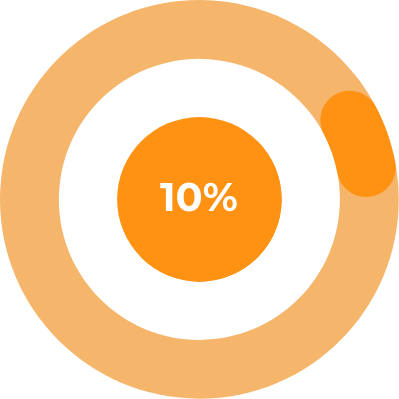
10% students never heard of SU Mobile
In interviewing four students, we discovered that they have never heard about SU Mobile App. They don’t use social media often. They told us if they need campus information, they will use google such as bus schedule, dining hall open hours, etc.
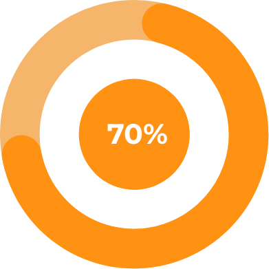
70% students never used SU Mobile
This was an astonishing discovery from the results. We realized most students used a search engine and the Syracuse website in order to access features that they needed. Some students know SU has a mobile app but have never bothered using it before.
What do you use most in the SU mobile app?
After the interview, we found most often features students use are MySlice and the Campus Map. Most students use MySlice to access their grades and class schedule. Students often utilize Campus map in order to find a building’s information and identify where their classrooms are located at.

“We always ask ourselves ‘What is the problem we are trying to solve?’ We often devise these grand features, that then get broken down into their most basic needs. ”
THE PROBLEM
The current experience
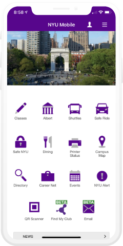
The current SU mobile app is complicated and hard to navigate as there are many usability issues within it. For example: the home page is overwhelming and contains items that every SU student may not find useful. I provide some examples to show you why this app can be found difficult.

Student service
Syracuse University has a unique student service called MySlice. Mystic is a platform that holds the overall essential information a student needs regarding academic life. Most students access this service through website. Only 5% of students identified using mobile MySlice, expressing how it has less features and is more useless in comparison to the website MySlice.

SU Academic
SU academics is the most impractical feature on this app. Users are not able to use this feature to achieve anything. If you want to use “Blackboard”, or “OrgSync” the app will open a new website or different app window.

Home page
The home page design is complicated and hard to navigate. Some features are essentially useless and users are not be able to delete or remove them. Also the user interface can easily confuse people.

SU Events
SU events is designed to help students quickly find campus events. However, the whole new interface is confusing to use. It is not the most functional way to find campus events.

SU Wallet
SU Wallet is built within the app. However, if students wants to use mobile payment, the system will automatically open a new window for students to sing in, which is redundant and inefficient.
USABILITY ANALYSIS
Cognitive walkthrough
Before we started our redesign, we wanted to conduct a cognitive walkthrough to find out what exact problems are present for the current SU Mobile App. The cognitive walkthrough is a usability evaluation method in which one or more evaluators work through a series of tasks and ask a set of questions from the perspective of the user. The focus of the cognitive walkthrough is to understand the system’s learnability for new or infrequent users. A cognitive walkthrough begins by defining the task or tasks that the user would be expected to carry out. It is these tasks the cognitive walkthrough will examine usability – any tasks that can be performed in the product but are not subject to a cognitive walkthrough will not, normally, be assessed during the process. We conducted a few tasks, for example, finding your class schedule, using the wallet app to get into dining hall, and finding campus events.

Taks 1
Find today’s campus events

This task required users to find today’s campus events. The whole process required fours steps, however, we found a few issues after conducting this task. The first problem identified happened during the second steps, if you take a close look to the page, you may find this page is really confusing. Users needed to take sometime to understand what is different between each category’s events. For example, with Bookmarked Events, nobody would be able to understand what is Bookmarked Events if you are a first time user on this app. Along with this issue, the events page is very unclear. The main problem as well is the space and readability issue. There is too much information presented in between each events. This makes user hard to navigate the information, and cause the terrible user experience.
Task2
Find class schedule

The second task was to find a class schedule, this task is set to test the usability of MySlice. The first problem we identified was in executing the second step in the task. The problem is every time after the user logs out, if they wants go back, it’s require user to log in again. We believe this step is design for security, however, we think this step is little bit redundant. Our solution is to design a log in process for users when they launch the app, which means users only need to log in once to access all the features in the app. The second problem we identified is that there are only four features in mobile MySlice, compared to website MySlice, mobile website is too simple. This is why student’s don’t want to use this app. Through this task, we understood the problem of the MySlice features and became ready for the restructure of the app.
Competitive Analysis
We analyzed multiple college mobile apps, including Harvard, MIT, Stanford, Yale, NYU, Columbia , in order to explore whether those school have the same issues as SU Mobile. The result was surprising, we believe some schools have the same problems like the SU Mobile app. We identified bad user experience, inefficient features, and unclear user interface, etc.


The first app we looked at was the Harvard Mobile App. What surprised us is this app has not been adapted for use on the iPhone X or the most recent iPhone designs, the screen size was not compatible. The whole experience was still kept within a 4.5 inch platform. We found that the MIT mobile app had a very unusual design compared to others. However the app allows users to customize the navigation which is a great feature for us to learn from. Overall we found the Stanford mobile app to be deemed the best design compared to the other apps we analyzed.


Yale Mobile app as well had an unusual design, the app is unclear and hard to navigate. NYU Mobile app had the most clean and clear design, it’s easy and simple to use and navigate. We found the Columbia University Mobile App to be confusing, and though we understand some of the features, the design is hard to navigate and use. The app requires time to learn and understand the structure. After we analyzed all the apps, we learned from each in order to avoid making some of the same design mistakes
BRAINSTORM THE IDEA
We started brainstorming some redesign ideas. We tested some ideas on whether they met our overall goals. For example, we designed different styles of the home screen, we studied the usability and took deep consideration about the user experience.


IDEATE AND VALIDATE
After the brainstorm, we began to organize our ideas by using the mind map structure. We believe through using the mind map, we are able to determine the structure of the new SU mobile app.


RESTRUCTURE THE INFORMATION ARCHITECTURE
After we created the mind map, we recreated a system map that helped us gain a more defined sense of the big picture for this product. We could see where the key interactions would take place and where some main user flows needed to be developed, especially the onboarding flow, the program and timer creation flows, and the workout timer flow.

SKETCH AND WIREFRAMES
To quickly test our concept, we started to sketch some ideas for some of the interface features. We created a low fidelity prototype for each feature to test whether the prototype met our overall redesign goal. Some sketches included a redesign to the login page, a new home page, MySlice, SU Events, SU wallet etc.


COLOR AND TYPEFACE
Our primary palette is comprised of orange, yellow, blue, white and purple. We wanted the new interface to look energizing and slick. Orange is Syracuse University’s main color, so we took advantage of different shades of orange and yellow to take the whole new interface into a new level. The main typeface we decided to choose was Montserrat, we believe Montserrat is less formal, elegant and simplistic which is best fit our design system.

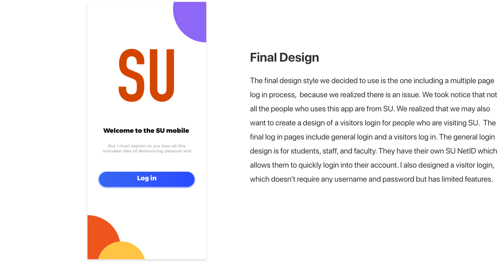
FINAL DESIGN
Reasoning for design decisions
I started designing high fidelity prototypes by creating a style guide for the user interface and determining major screens of the app. I used Adobe XD and for UI design and InVision Studio for some motion design.

Log in
After we conducted the cognitive walkthrough, we decided to completely redesign the login page. We believe the new login page is needed for users. Through the log in page, user will never need to log in any user account in the app. For example, MySlice students account will never require students to log in over and over again.


Home
The home page was completely redesigned for better user experience. We sketched lots of idea about what the new home page layout would consist of. We understand that the concepts of utility and efficiency are the key for home page.


Final Design
We believe the initial design was not perfect. In order to keep all UI element consistent. I redesign some of the icon and kept it same style, also I change the shadow and the home page color. I use light warm orange color make whole interface softer and easier to accept.
Initial Design
For initial design I completely redesigned the whole new interface, include new icon and layout. Especially, I increased the macro space between each icon. I want to provide user the most clear and simple interface to use.


Customizable
Customizable is a new feature that we added into the app base on user interview, we believe this feature will create utility for using this app. Users can customize their home screen by clicking the plus box to add more functions or delete functions.

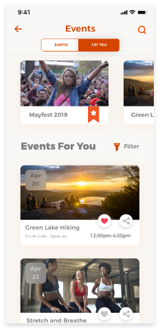
SU Events
SU events was the most challenging part for our redesign. We believed the SU events feature needed to be completely redesigned for better functionality. Starting over form the beginning , redesigning this feature was a complex task. In sketching some ideas about the new user flow, we wanted to keep user interface simple and leave the most important information.


Events detail
When users click on the events, they will gain more knowledge as to what the event entails. The feature presented include time, location, instructor information and contact info. The user can quickly add to SU calendar or share to their friends.

For You
For you is a new feature I added in the SU events page and it works based on what you have interacted with or your previous attendance to events. For you will automatically recommend events for users. Users can choose to view the most popular events at the top or specific events recommend towards them by the system.

New events, New experience
The events page has been complete redesigned. I chose to use card design to separated each events. Adding an events page and a “for you” page to user for better using experience. Events page includes all of the latest events ordered by data and time. We also provided users with the price for events. If user are intrigued about a specific event, they can access more information just by simply clicking on it.

Description
By simply clicking the up button, user can view the description about the events. I utilized the negative space to provide user the most readable information.


SU calendar
SU calendar is a new feature presented within the SU mobile app. Based on our interview, we understand students requested a way to easily check their class schedule without logging in to their student account every single time. In order to achieve this goal, we wanted to design a calendar which can automatically organize user’s all-day schedule. We want the SU calendar to have the ability to combine personal event, class schedule and campus events.


SU WALLET
In the new redesign, we plan to have the SU wallet feature be integrated from the GET app. The current SU mobile design includes the student wallet feature to help students check their account. However, the design is limited, as students aren’t able to check directly from the SU mobile app, instead the app will take the user to an external app called GET app. Students find the GET app essential as it’s used to deposit money or check for meal swipes. For the redesign, we decided to create a practical and very functional SU wallet, wherein students have direct access to the SU mobile app.

How does the GET app work ?
In the GET app students can view their account information, deposit money to their card or use the barcode provided by the app to gain access into the dining hall. It’s provide students an easy way to manage their students account by using this app.

Final design
The final outcome achieved our overall redesign goal for the SU Wallet app. On the top part I used the card style to show user’s account information. On the right, users can quickly deposit money to their student account. I also added a history transaction record for the user to understand each transaction clearly.
What is GET app ?
GET app is a mobile platform meant to help students manage their food and meal plans. Students can use this app to deposit money to their student account for food, laundry, etc..

Sketch
Everything began from the sketch. I sketched the interface that I believed was the best fit for our design goal. I wanted to keep all the features from the current GET app, but remodel them to be simple and easy to use.


SU MYSLICE
MySlice is a student service website operating for class registrations, class grade viewing, bursar payments, housing selections, meal plans and more. Faculty and staff can upload grades, view paychecks or time off, manage benefits, and more. The new mobile MySlice provide students and faculty the most straightforward user experience to achieve the task.

We realized it’s impossible to redesign all features in MySlice, so to create the best redesign possible, we decided to focus on one task experience. Our team decided to focus on the task ‘Enroll in a class’. We chose this task because we saw the problem through our cognitive walkthrough. We planned to not only redesign the new interface, but also focus more on user experience and utility base.

SKETCH
We created some sketches exploring different ideas for mobile MySlice. We believe keeping user habits was important, because a good system shouldn’t require user to study how to use. Our redesign was based on the website version, and upon further visions we used cards and different colors to differentiate each sections.


In website MySlice, the user can access seven sections, and each section has a unique function. For example student services is everything related to student college life, as well personal services is used to change personal information such as address, phone number. We initially created four different styles to match our design goal.


Final Design
The final design we decided on uses the round border with different color style. We wanted keep it simple and match the system UI. We also designed the new icon to match each different section.

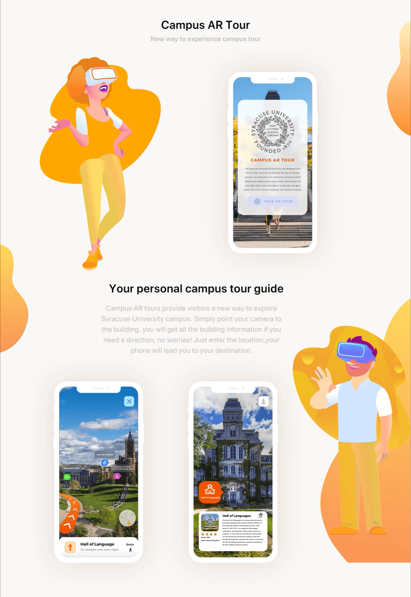
CAMPUS AR TOUR
With an increase in campus tours, more people come to visit Syracuse University. Most people will schedule a campus tour through the online reservation, yet a redesign can be used to create a new experience for campus tour.


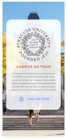
Main page
Users are able to access this feature anywhere on campus just by simply clicking ‘take AR tour’. This requires the app to determine the user’s current location in order to create a 3D map for users.
Dark mode
Dark Mode introduces a dramatic new look for SU Mobile accessible to students, to promote different preferences. It’s thoughtfully designed to make every element on the screen easier on your eyes and is seamlessly integrated throughout the system. It’s simple to turn on from home screen or set to automatically turn on at night.

Initially we designed three different dark mode looks for users, yet once completed, we wanted to choose the best option for the final design. However, we found that the different designs produced were preferred by users, so we decided to give users the right to choose the look they want. Users can easily switch just by clicking the light-bulb button in the home page or change it in the setting. The dark theme is seamlessly integrated throughout the system. User will get a full dark experience in the night time.


Siri Support
To further fulfill our goals, we added Siri support for the new SU mobile app. Users can utilize systems such as Siri to vocally prompt functions such as viewing a class schedule, seeing what class they have next and seeing upcoming activities


USABILITY TESTING
Communicate & text redesign with users
Now that we have created a few variations of the redesign, it’s time to get feedback from people outside the organization. We capitalized on an existing user base and used their feedback to gain insight as into which areas of our app need further refinement.


We evaluated our system base on Nielsen’s Heuristic evaluation method. We focused on some parts of the experience, for example: whether the user interface is simple and natural dialogue, whether our redesign interface is consistent, or the need to minimize user memory load, etc. We conducted these evaluations on our computers. We asked questions such as, “what do you think about our overall redesign?”, “do you think it is easy to use?”, “would you like to give us some advice to help us improve our design?” Through our evaluations, we changed a lot based on our original design. For example, the wallet feature we designed is based on the Get app and we did not make the design consistent with the new SU mobile app user interface. The original color we chose for redesigning the SU wallet is dark blue, and our primary UI color for SU mobile app is light orange. After we evaluate our original design, we redesigned the interface to make it consistent with the app main user interface. The color matches the main apps interface; all the icon and typeface are consistent with the main UI.
PROJECT LEARNING
1 Collaboration is key
Collaboration allows team members to come together on a common platform and work towards the achievement of a common goal by thinking, brainstorming, and offering various perspectives to provide solutions. During the design process, having different perspectives on the SU mobile app experience was essential to creating the best version.
2 Process in essential
The more eyes on a design, the more it’s exposed to varying opinions, experience, and critique — and this can only ultimately improve it, or at the very least, test it.
3 Simplicity is strength
As a designer, we are often lured by attractive, trendy and out of the box designs. But We must always remember the ‘Why’. The primary goal is to understand the user, their problems and then come up with a design that solves it.
REFLECTION
In presenting our new redesign to students, we found that it was a big hit. Overall we believe that our redesign of the SU mobile app would be beneficial to students at Syracuse University. Not only will it help all students with their day-to-day routine, but will over encompass essential needs. The new features will help incoming first-year students and their parents immensely in navigating the large campus. Our app will be able to change and adapt as students grow as well. We believe that the design process though is really never ending. There is still so much we can do to improve in the future, the potential is never ending. If time permits, we plan to work on more details about the App.