

Project Overview
Taster food magazine design is the final project for my Intro to graphic design class. In class, the professor assigned us to design a magazine including cover pages, content page and a back page. The main software that I used to design this project is Adobe InDesign and Illustrator. My overall design goals were to create a magazine with an authentic feel.
Project Role
Graphic Designer, Illustrator, Magazine Designer
Tools & Duration
Adobe InDesign, Adobe Illustrator
Nov - Dec, 2018
ABOUT TASTER
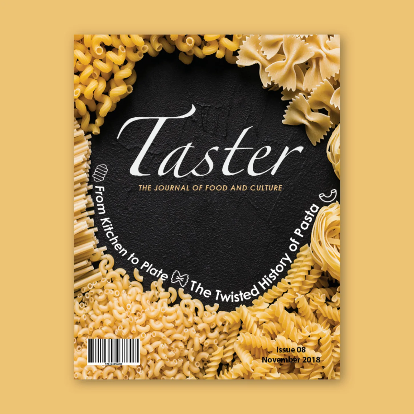
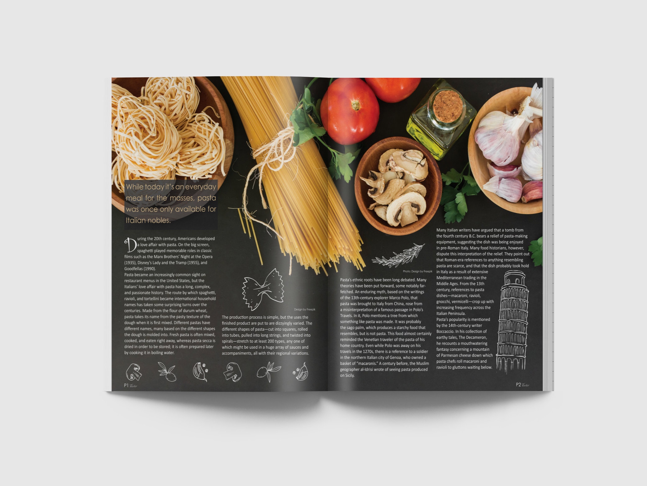
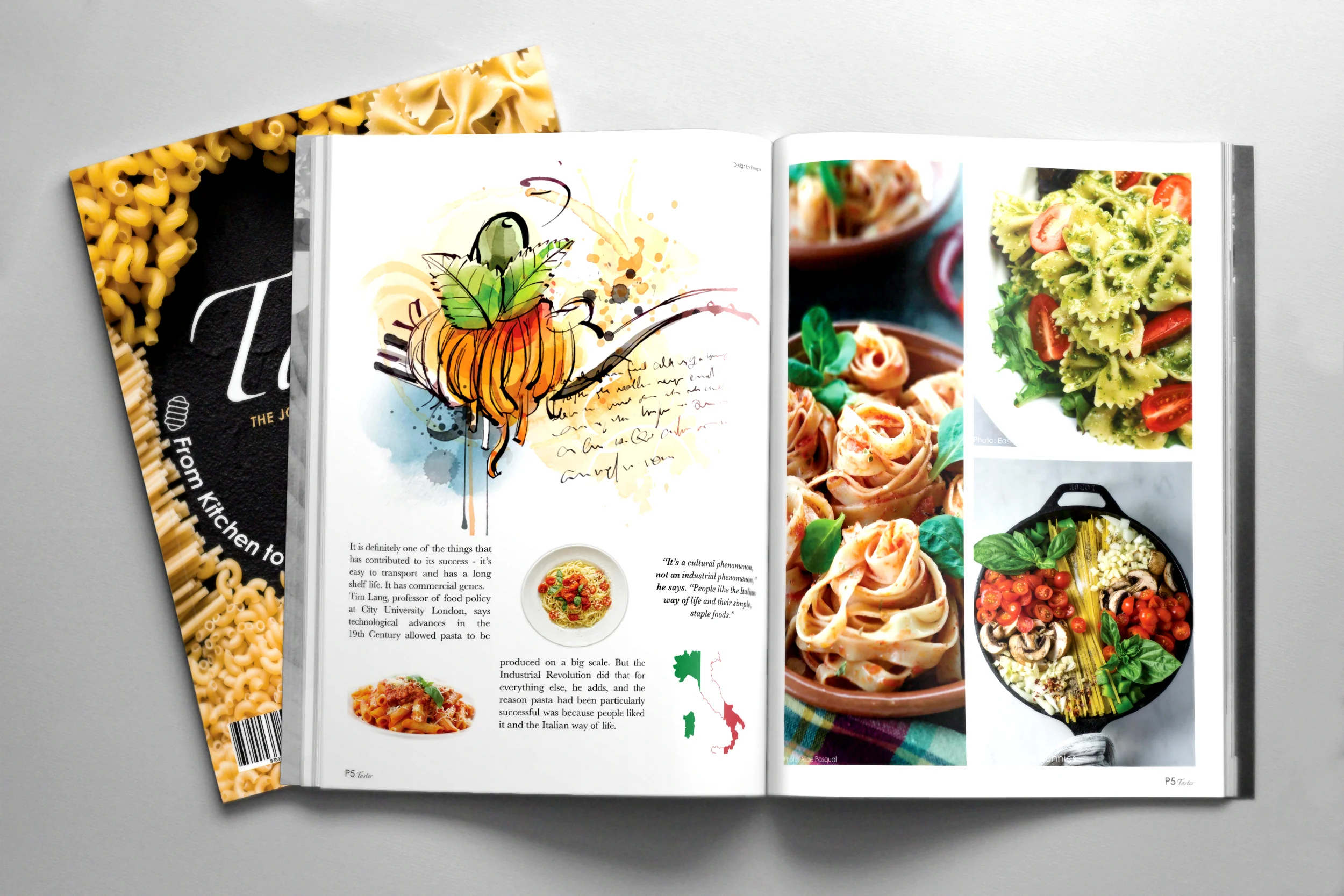
Taster is a food magazine presents a topic related to food every month. The audience for this magazine is for people who love food and its history or want to delve into the work of culinary arts. I decided to design a food magazine because I found a fascinating article about “The twisted history about pasta” The article touched upon pasta’s history and pasta’s evolution. I read the whole story before I designed this article’s layout in order to gain a better perspective as to what this type of writing contained. After reading the article, I found out I couldn’t use lots of random pasta picture to express this story, because this article is not about a different kind of pasta or pasta’s recipe. Instead, focusing on showing the evolution of the pasta is the tricky part of this design. So I decided to used illustration to lead the audience to read the article. I used different illustrations to correspond to the storyline in order to drive the audience and gain their attention.
TYPEFACE
I sampled a variety of typefaces for my magazine design. For the magazine cover, I used the Zapfino and Century Gothic for my cover typeface. I chose to use Zapfino for my magazine title because Zapfino has much perfect for my magazine cover. I decided to choose Zapfino and make my magazine looks more professional and correspondent with the food theme. Century Gothic is another typeface that I used for the magazine cover. I chose to use Century Gothic because it has a sleek, modern look. The audience can easily understand what the article about is.

The primary article typeface that I chose to use is Calibri and Curlz MT. When I designed my magazine, I sampled more than 30 typefaces to see which one would have the best readability. After careful filtering the typeface, I decided to use Calibri for my main typeface. First, as you may know, Calibri is Microsoft Word’s default font, thus, it’s widely available, familiar, and easy on eyes. Second, Calibri has a strong readability, especially when you go along with a long story, Calibri has the ability to make your eyes feel more comfortable. The second typeface I chose to use is Curlz MT. This is an interesting typeface; I decided to use this for the foreword of the article because the story that I chose has some humorous elements. Curlz Mt can easily express a relaxed and fun atmosphere.
STYLESHEET
The font size for the main body paragraphs I chose is 12 point and in the leading space I decided to use 15 point. In using 12 point and 15 point size fonts I can make the whole article simple and unite. In addition, a 12 point font size and 15 point leading space would perfectly fit my magazines layout, keeping a zero for the tracking space. For each section headline, I utilized a 19 point font size and a 24 point leading area in order to create the best readability.

For the margins, they occupy 0.5 inches to the right and left and top on my jump spread. For the bottom, I have 0.3125 inches, in order to have space for the illustrations at the bottom. I have two columns on each spread on my jump spread, and for my alternative spread, I have three columns on each. Each side will occupy a 0.5 inches margin. For my open spread, I have a 0.5 inch margin for both left and right top and bottom.
VISUALS
For the process on choosing visuals, I sifted through each picture very carefully, because I believe each image needs to correspond with the content of the article. I chose the two main images from Adobe Stock which matches the magazine’s theme. After this, I started creating the grid system based on the page layout. I designed and fit the content in the grid system, and then I started looking and designing the illustration for the article to make sure the visual effect matched the whole story.


SELF EVAL
This project consumed a lot of my time due to how invested I was in the theme. Sometimes when I designed the magazine, I felt like I was part of the story. Being a designer, not only do I have the ability to view and create the visual effects, but it also demands from me the ability to examine your work from a different perspective. For example, when I chose the typeface, I would put myself as the reader and asked myself if I would have a comfortable reading experience. Different typefaces and different leading spaces can create a variety of reading experiences. At times, I also needed to care about the visual balance presented in the magazine, because if you have too many pictures, it will take the attention away from the main content. Throughout this project I kept in mind how everyone has a different aesthetic perspective. For this project, I created some extra pages for my magazine, because I wanted to create the best outcome for the final project. I will keep those additional pages in my file folder, in case you want to look at it.