


Project Overview
In this solo project, I reimagined their OurAbiliy connect dashboard system, including the dashboard interface, new user flows, content strategy, etc. I spent time doing research and understanding the overall user’s experience. My goal for this project was to rethink the user’s need and to redesign the overall user’s experience to reimagine how to create the most functional dashboard system to empower disabilities employment.
Our Ability’s dashboard design is the most challenging project I have worked on. I had to focus more on user experience for disabled communities, which requires rethinking the user’s experience from top to bottom, primarily focusing on core interaction and accessibility feature designs to make sure all the components are completely user friendly.
Project Role
Solo Product Designer, UX Research, Information Architecture, sketching, prototyping, Visual design & testing, project management
Tool
Adobe XD, Figma
About OurAbility
Who is OurAbility ? What is OurAbility Connect ?
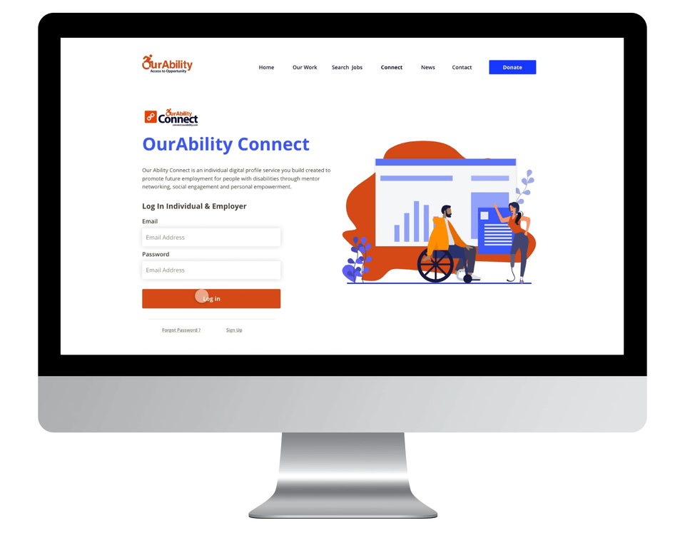
Our Ability Inc. is a company which uses the latest AI technology to create accessible and inclusive technology for the employment of people with disabilities. The company enables people with disabilities to Dream a Better Life Through Employment. Our Ability Connect is an individual digital profile service you build to promote future employment for people with disabilities through mentor networking, social engagement, and personal empowerment. Our Ability Connect gives employers the ability to reach out to people with disabilities by searching, connecting directly with people in our system, and posting employment opportunities in order to recruit the best candidates for open positions. The current features for Our Ability Connect dashboard includes a user profile, which allows users to create their own job profile. Networking allows users to create a network of individuals and employers to support their career goals. Dashboard, connect, and provide a dashboard of job updates each hour's information on employment. Employers search and connect support employers interested in adding a dedicated workforce by allowing them to search the database based on the candidate's Ability !


Challenge
What is challenge for this project ? Why is Challenge ?
1. Accessibility Design
This project requires me to put accessibility in the center of everything. Every decision that I made needs to be accessibility friendly. Designing for accessibility may be difficult and challenging for companies or some businesses, but I believe a good product should empower everyone. As a designer, I feel that I have the ability and the responsibility to help change how we design for accessibility.
2. Rethinking the user experience
After I analyzed the whole system’s current Our Ability Connect dashboard system, I had made a tough decision to redesign the entire job dashboard system from top to bottom. First, our design team had made a major design for Our Ability website, which includes the new web architecture and new visual language. The new dashboard should not be based on the old website design system. Second, the current dashboard had inconsistent user experiences and lacked utility. Users did not have a coherent experience when applying for a job through the dashboard, such as missing links and unclear messages that cause the negative user experience, which makes me believe redesigning the whole experience was necessary. Lastly, to get rid of the immature feeling and give the Our Ability dashboard and brand a more mature appearance. I could not improve and add lots of features for the new dashboard system, but I chose to work on the most important features, and maximize the overall user experience.
Process

This project was divided into three stages. The first phase was to develop a research plan to understand the current usability problem for users with disabilities on the current dashboard system. This included studying and understanding accessibility design using multiple user research methodologies. The second phase was to compile all the research to design ideas. The third phase was to deliver a user-friendly, and intuitive dashboard validated through an iterative research and development process. The research began with a cognitive walkthrough that focused on understanding what the major pain point for the platform's important features people who have created e-commerce websites were interested in.
Discover and Define
What is the problem ? What is the goal for this project ?
In order to better understand user experience for OurAbility Job Dashboard, I need first to understand this platform. I set out to learn as much as possible about the OurAbility Connect with a few research goal in mind:
1 What is the current user experience of OurAbility Job Dashboard?
2 What makes the overall user experience unique and challenging?
3 What is the major user pain point on the platform?


Deep usability analysis
Cognitive walkthrough & User Journey Map
After some analysis of the current experience, I understand the problem for each page. I discovered both good and bad experiences for the current Connect Dashboard. However, I believed I needed to do more to understand about the current experience at a deeper level. I used a cognitive walkthrough to get a deeper analysis of the usability issues. The cognitive walkthrough is a usability evaluation method in which one or more evaluators work through a series of tasks and ask a set of questions from the user’s perspective. The focus of cognitive walkthrough is to understand learnability for new or infrequent users. A cognitive walkthrough begins by defining the task or tasks that the user would be expected to carry out. It is these tasks the cognitive walkthrough will examine usability – any tasks that can be performed in the product but are not subject to a cognitive walkthrough will not, normally, be assessed during the process.

Key takeaways (User Pain point)
1 Our Ability Connect dashboard is not a mature product for users to use.
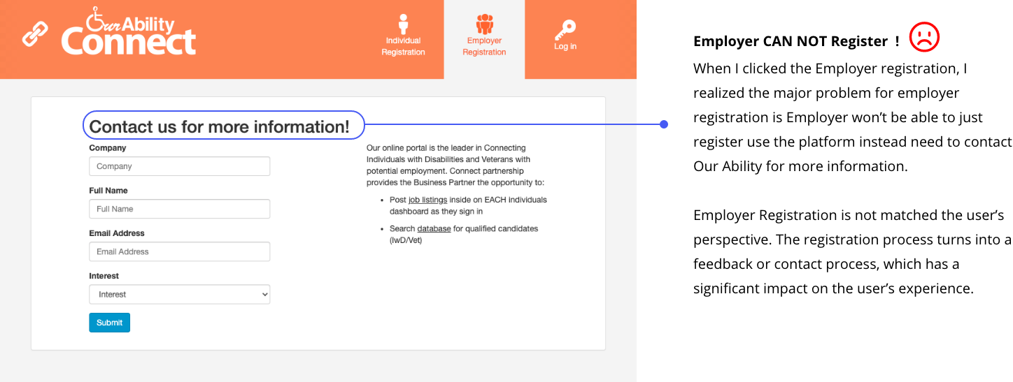
Through analysis of the current Dashboard experience, I realized Our Ability dashboard had unclear product strategies. There are lots of usability issues that are not being considered when designing and developing this product. For example, users do not need to have a dashboard to search for jobs, which makes for redundancy. The question left for me to think: What are users expecting for the dashboard? What is the goal for users when they are using the platform?
2 There are a lot of heavy user experience problems waiting for Our Ability to solve.
Some problems are not severe enough to influence users’ overall experience, but some problems are. For example, when users click to view a job, the dashboard will bring them to a new page that includes a new navigation bar, which does not make any sense. Another problem is the missing link and page not founded issues, which is a severe usability problem. Finally, I realized that employers and individuals have two significant experiences when using the dashboard. For employers, they need to contact Our Ability to learn more about their product. For individual users, they can register using the dashboard without the extra step. The inconsistent experience needs to be solved.
3 Accessibility issues.
Accessibility is my primary focus for this project. I realized that the current dashboard doesn’t have any accessibility friendly features, which is a huge problem, because lots of people who come to the website or dashboard have a different ability levels. There needs to be some accessibility features such as zoom in or out, reduce animation, etc. to help users better navigate the platform.
User Interview
I also conducted interview with three users to help me get deeper understanding about different user’s perspective about the platform.


Key Takeaways
1 Participants said the Job Dashboard should focus on Job search and features relate to jobs. People want to apply for the job within the job dashboard rather than take in the company's website
2 Participants believe accessibility features are essential for any digital system. People suggest designers follow the accessibility guideline and user references to make the product work for everyone. Also, designers should get more insight from disability users to better understand how to make the system accessible.
3 For accessibility features, I know lots of people are not familiar with it. Some participants said features need to be clean and clear to use. Some people consider the different types of accessibility, such as people who have vision and mobility problems.
Competitive Analysis
Next, I analyzed the market for job Dashboard. What are other job boards doing ? Is there anything I can learn from it ?
With so many job boards to choose from, I wanted to analyze what was working and what wasn't and see what I could learn. I looked at a few popular Job board to see if they were taking a different approach.

Linkedin:
Pro:
LinkedIn is a popular and familiar company so any new feature would be an extension of its existing product and won’t require extensive user acquisition and orientation.
Con:
There’s no way to meet new people. Users can search for people, but building a relationship requires the other party to be interested enough to accept the connection request, respond to the message, and make time to meet. Also, no data to help users see the company info such as Salaries, etc.
Glassdoor
Pro:
Glassdoor is the second largest job posting and recruiting website besides Linkedin and is trusted by millions of employers and job seekers. The advantage for Glassdoor is allowing users to gain some insight about company reviews, interview questions, etc., which help users better understand the company culture by viewing the company data.
Con:
The first disadvantage is Anonymity. It’s hard to help users trust the anonymity person’s review and comments, which will reflect the overall data accuracy. Second, not focus on connections. Glassdoor won’t allow users to add or connect different users, making it hard to create a great employment network.


Meetup:
Pro:
Events are better for engaging in meaningful interactions, and Meetup helps users discover relevant events based on their interests.
Con:
The online experience lacks a robust social aspect. Users can only interact with each other in limited ways before an event and can’t connect after an event without using a separate social network.
Ok ! It’s time to organize little bit about previous research finding, and start thinking about design !
From the previous user research and competitive analysis, I got a clear direction about what I need to do for the next move. I had some ideas about the design, but needed more thinking on it. So, I conducted the whiteboard exercise, and card sorting for me better underused the next move.
Whiteboard exercise
First is user Personas. I did a brief interview about it before, but the key point for me is to understand what the target user is for the dashboard. Due to lots of research that I did to match the research that my team and I did in the website redesign project, it is easy for me to understand the key insight.
Second Assumptions: I start to make some assumptions based on my research. What do users really need for the dashboard? How can everything work simultaneously? Because the Dashboard is called Our Ability Connect, I think connection is important for me to think about. How to connect people who have disabilities?
Third problem space: How can I measure the problem? What methodology should I use to solve the problem? How to solve the problem is too broad to solve for it?
Finally, solution space: How can I approve my Solution work? How can we measure the success for our solution?

Key Takeaways from whiteboard exercise
1 Need in-depth research about the accessibility design.
Through the whiteboard exercise, I organize some previous findings of the platform and problem. However, I seemed to be missing something, such as accessibility design. Where should I start? How do I do it? From there, I need to do more research about accessibility design.
2 Use reference and resource to design the accessibility features.
Accessibility is too broad; it’s impossible to cover everything. So I decide to use some reference to help me better understand where I should start.
3 Accessibility by category
Accessibility features by category are my initial thinking. I should categorize each accessibility feature that I want to build in order to help me better provide the final solution.
Brainstorming ( Card Sorting )
To be honest, the Whiteboard exercise makes me feel more confident in approaching future design opportunities. In order to help me better organize my thinking, I did some quick brainstorming. Brainstorming and card sorting should be team exercises. Due to quarantine circumstances, I broke the brainstorming session into every three days, I added some new thinking, which helps me get fresh air every day from my mind.

Key Takeaways from Card Sorting
My card sorting strategies make everything that I did clearer and straightforward. I realized I had come up with lots of good ideas, so I organized all the cards by four categories: Accessibility Design, User Interface, User Experience, and major features. Open card sorting helps me get more insight into what I should work on more. I indicated some of my good thoughts and realized that I need to get more insight into the accessibility design and overall user experience. My initial thinking about the UI is just clean and straightforward, but I believe this needs to be a balance between UX and UI. I didn’t want to give up more UI and ignore the UX part. So I think more research would help me to get more understating about my future design.


More research about Accessibility
1 Understand Accessibility
Accessibility allows users of all abilities to understand, use, and enjoy the web. As designers, it is our responsibility to make sure we design in a way that is usable to all users irrespective of their situation, abilities, or context. The first and foremost step to build an accessible product is to build empathy and install an inclusive design mentality. Accessibility is not confined to a group of users with some different abilities, for example, visual, motor, auditory, speech, or cognitive disabilities, rather it extends to anyone who is experiencing any permanent, temporary or situational disability, e.g., having only one arm is a permanent condition, having an injured arm is temporary, and holding a baby in one arm is situational — in each case the user is able to complete tasks with only one hand. Therefore, the aim is to make web content more usable to users in general.


I started to review a variety of accessibility guidelines to help me better design for accessibility—for example, Google accessibility design guideline, WCAG, and Apple Human Interface Design guideline. I learned a lot by reading the guidance, and I believe there are lots of major principles that I think are useful for me to take into my later design. There are lots of similarities between different guidelines. For material design, the three primary principles are clear, robust, and specific. Apple Human Interface Guideline indicated that accessibility design should focus on simplify, perceivably, and Integrity. All the design principles guide designers to focus on how to design simple, transparent, and humanized products. After reviewing some accessibility guidelines, I have concluded some key design takeaways.
Goal for accessibility design:
1 Consistency and Clarity:
All the design guidelines indicate that consistency and clarity is the essential rule that designers need to follow. Compatibility means keeping the same elements and color style. Also, the UI component with the same functionality should be consistent, which helps users identify components on different pages with desired functionality. Users with difficulty reading text are highly benefited from this. Keeping labels consistent also helps to achieve a more predictable experience. It also allows users with low vision or cognitive disability, and helps them to identify the content more accessible.
2 High color contrast, BUT color can not be the only way of conveying information.
High color contrast helps people easily identify the content. However, for people who are unable to determine the color or have difficulty distinguishing color form another visually accessible, it is necessary for them.
3 Provide visual focus indication for keyboard focus.
This important principle that I learned through the research. Providing visual focus is vital for users who have motor-related disabilities and cognitive learning disabilities.
4 Don’t make people hover to find things.
This principle mainly serves people with motor-related disabilities. This includes keyboard-only users who have a vision and those who use speech recognition tools like Dragon Naturally Speaking to interact with the system.
2 More about Color
Color is the key to visual design. Sometimes, color is natural for designers to choose, some time is not. For the project, color is the most crucial element that I need to focus on. It’s not a simple job to make every color accessible. So, I spent time analyzing the current OurAbility website in order to understand the color better.


The color problem
I used the color review tool to test both website and current dashboard color. I found that Our Ability primary website color matches the accessibility standard. However, the dashboard color has some significant problems. The color that the current user is light Orange and blue. The bright orange color does not meet the accessibility standard that fails both text and headline. The contrast ratio is only 2.4. The light blue color also has only a 3.3 color contrast ratio and failed the text accessibility standard.


Ideated for the color
The research finding points out to me that the color needs to be fixed. I decided to start finding the primary color, which I decided should keep using the blue color but need to meet all three accessibility standards. The primary task for me is to find the best blue color that matches all accessibility standards and needs to fit the modern system design, which means it should visually look good, also meet all accessibility standards.


Final Decision
I chose three colors that meet all accessibility standards. All three colors have strong contrast, which will Fremantle increased the user experience.
After more color reach and study, It’s time to think about the user flow and dashboard architecture. I used some UX methodology such as mind map and Impact and Effort Matrix to help me determined the dashboard arctiructure and user flow.
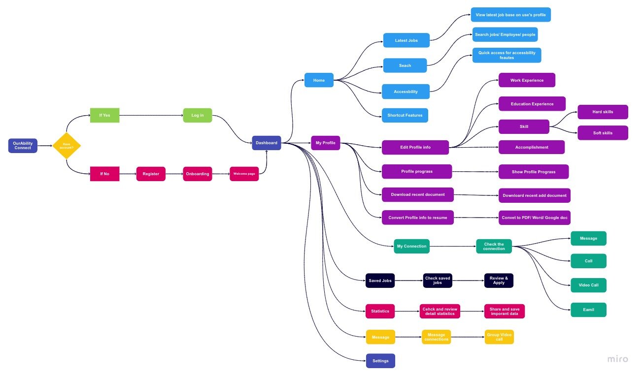
Mindmap
What are the core features of the New OurAbility Dashboard ?
The core features required became more evident after defining clear user needs. Under time limitations, I had to be smart about not trying to do too much but focus on the core user needs. I had to decide - what were the minimum set of features the dashboard needed to offer to make an impact on user’s job teach experience.

I have a total of six interfaces based on my previous study, and I believe it will help users achieve their goals by using the new dashboard system. There also have four major interfaces. First: Home page. The home page is the main interface that users will first see when they log into the system. The home page should be simple and easy for users to discover the latest job and quickly interact with disability features. Second, user profile. This page will allow users to edit their personal information, letting other people or employees understand their job goals quickly. Third, the connection. The connection is an excellent feature that will help people to connect through the OurAbility dashboard. Users should be able to use this feature to connect other users or employees to build their own social and career relationships. Finally. Statistics. I want to create an interface that allows users to use data to measure their career goal to understand better what they need to improve or gain in their future career joinery. I also made some notes that I believe it should be thinking about it when I design the interface.
Main User flow
The user flow is base on the mind map that I created. It’s included all the features in different categories. A user flow was carefully constructed before any wireframing to get a holistic view of what the function would look like and gauge the screen design requirements.

Sketch and Wire-framing
#1: How might we design the dashboard and make it easy and simple for people to use ?
I began to sketch some of my initial ideas about the dashboard, including a basic layout, navigation bar, button, etc. The main goal for me was to create a simple and easy to use dashboard arrangement. I spent a lot of time finding the most efficient layout by sketching different designs and comparing each one to understand how to present all information clearly to users.


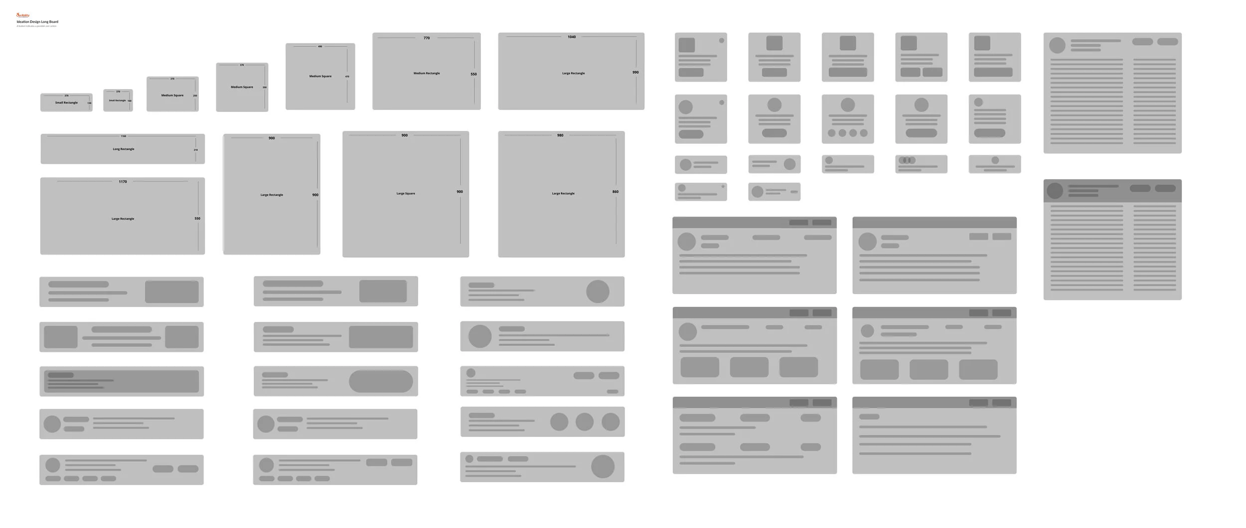
Layout
After I studied the layout, I designed a few rectangle and square containers to fit the new dashboard's entire user interface. The different sizes of containers will contain different information. Each container design will help the pages be more responsive to fit different screen sizes.
Final layout design
All the page layouts are designed based on the function and user experience. I believe the simple layout will help the user understand the content more clearly and straightforwardly. To provide users with consistent user experience, I optimized features such as spacing and unified the content information. For example, both ‘Save Jobs’ and user connection pages have the same design layout, which reduces the user’s cognitive load in helping them find information. The process is quicker and more efficient.


Hi-Fi Prototyping
After a few rounds of design testing, I have finalized the design for the dashboard. I started to design single elements of the whole user interface. I thought carefully about all the previous research and applied some key takeaways from previous research to the final design.

Introducing…
The future of OurAbility !


Before

After

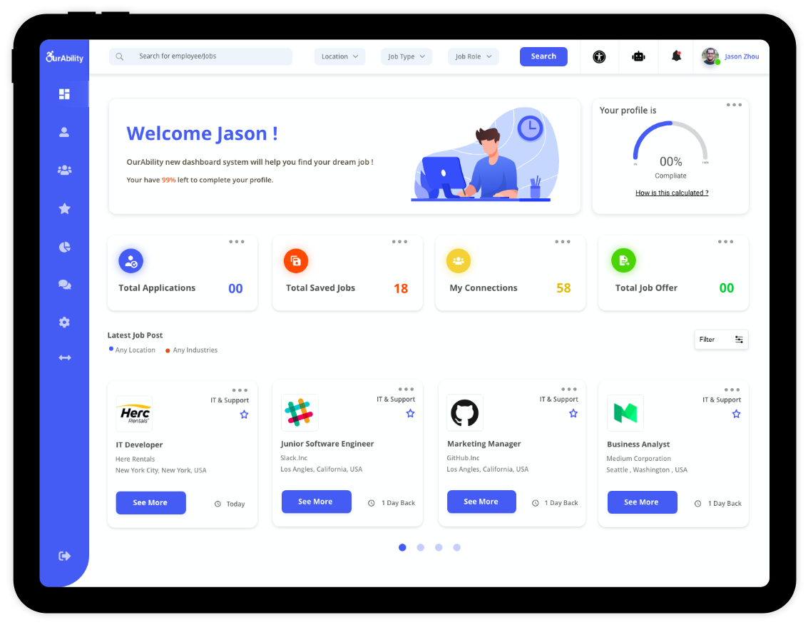
Home
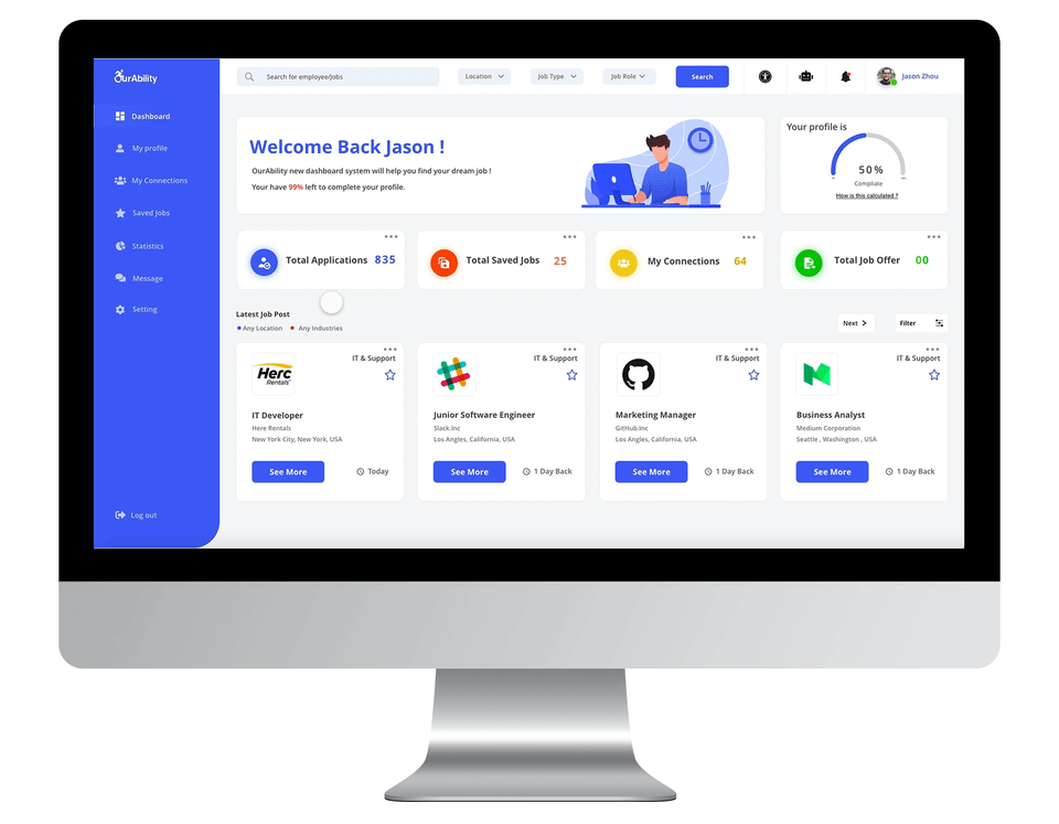
The Home page has adopted a simple layout to help users quickly interact with the dashboard. A redesigned sidebar helps the user understand the system function without further study. The navigation bar has included quick shortcuts such as accessibility and chatbot integration that maximize the user experience. The primary user interface is also designed to access all the information they may need, such as profile progress, quick view applications, etc.

Accessibility

Chatbot

Notification
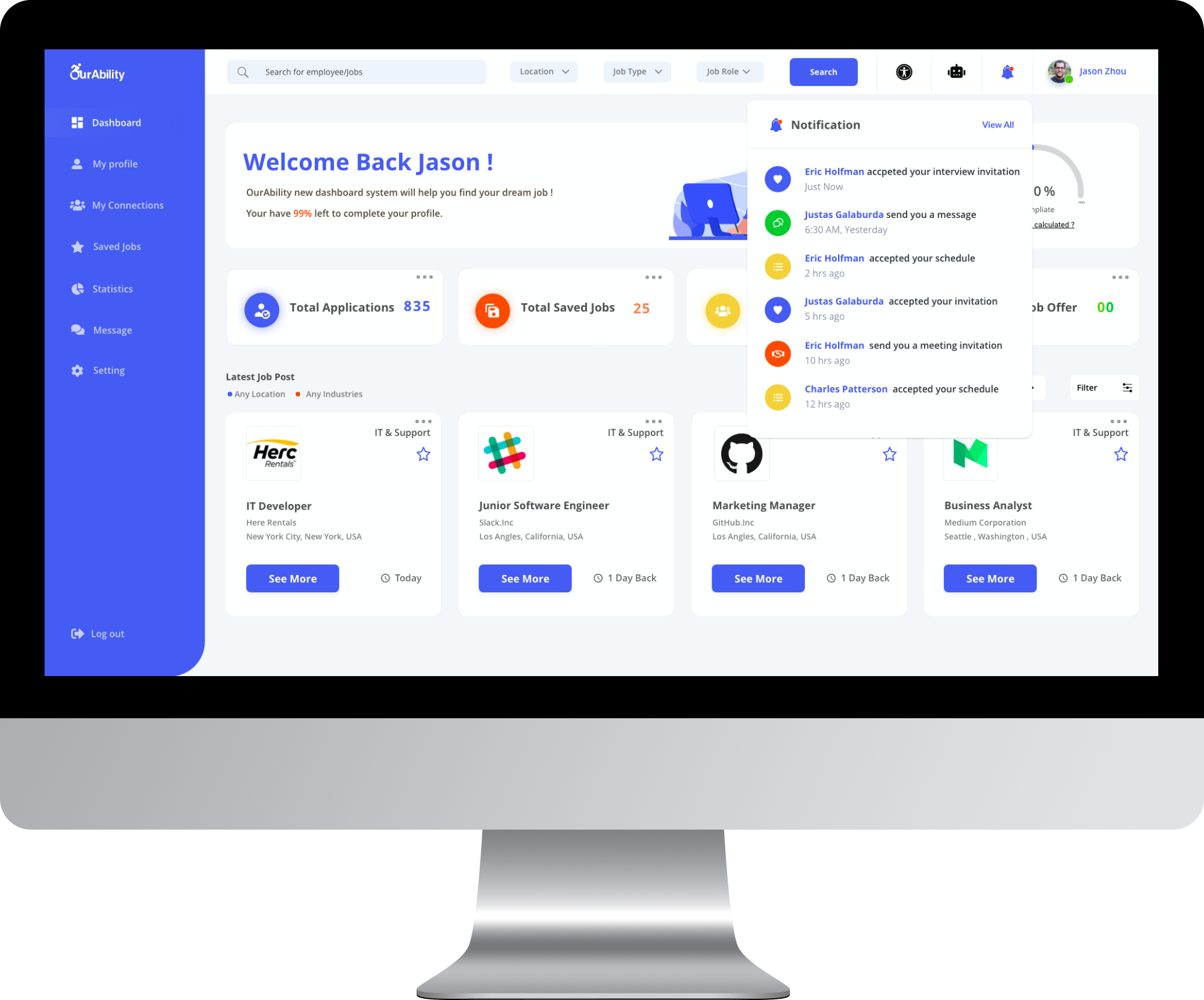
Shortcuts
Shortcuts allow users to preview the Information such as total job applications, connections, offers. When users click the total applications, they can quickly preview their latest job applications, links, and offers they have received.
Pain Point solved:
Enhanced user experience allows users to review information quickly.
Job search
Job searching is a significant experience within the job dashboard. Instead of designing a specific page for a job, I rethought the searching experience by creating a universal search function on the top navigation bar, including job search, connection search, employee search, etc. The new design will deeply integrate with the system that provides users a great search experience within the job dashboard..
Pain Point solved:
Improved overall search experience, helped users search the information quickly.

Onboarding
Onboarding is important for first-time users to explore the platform. I kept the onboarding experience simple and easy by allowing users to choose the customize theme in order to help them quickly set up for using the system.
Pain Point solved:
Provide users a process to get familiar with the system, allow users quick to set up accessibility features such as colorblind mode. Reduced user system study time.
User Profile
User profiles allow users to quickly manage their personal information, such as employment history, skills, etc. The profile progress bar helps users understand their overall profile quality. The recent documents feature allows users to quickly download the latest file such as resume cover letter etc. I also designed the Resume Conversion feature to enable users to convert their digital profile to a variety of file types.


Resume Conversion
Resume conversion is a new feature added after the user feedback. I believe it will empower a user’s employment. Users who don’t have a digital resume will use this feature to convert their profile to a digital resume automatically. They can choose different types of files, such as PDF, HTML, Word, etc. I also designed different styles of resumes to allow users to select downloads.
Pain Point solved:
Huge user experience improvement for users who don't have a digital resume. Save users time for making the resume.

My Connections
Network connections are the feature that should have happened in the current version of the OurAbility connect dashboard. The question for me is how to build a connection system to help people get closer? I believe the connections feature should empower the disabled community and their employment. The New Connections feature will allow users to communicate with other employees or employers. Users will be able to view other users' profiles to connect with them to build a closer connection with other users to empower their career opportunities.


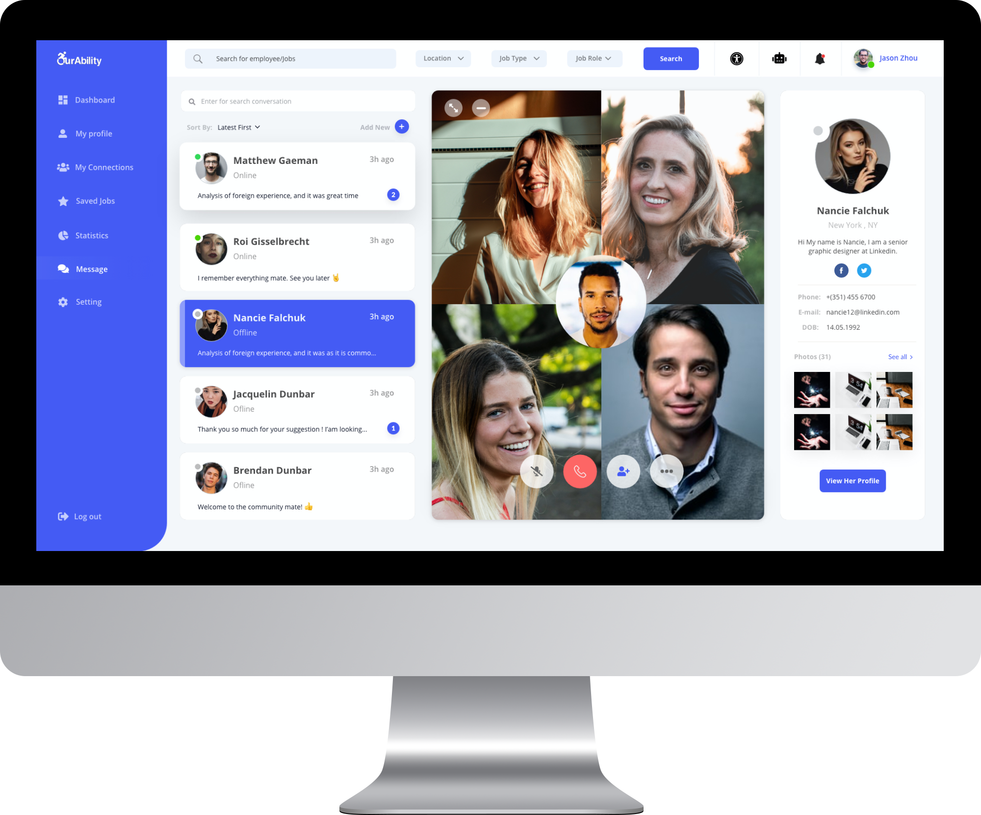
Messages
The message feature is the key to communications. I took some inspiration from LinkedIn and other social media. Messages allow users to stay connected with their connections, employer, HR, etc. The new messaging feature also enables users to chat with multiple users while splitting windows. Users can minimize their window to bring the conversation to anywhere within the dashboard. I believe this is a great feature to increase the user’s working efficiency and help users build strong career relationships with other people to empower their future employment.


Video / Voice Call
Video and voice calls provide users a new way to interact with people within the dashboard. Users will be able to make a quick call with their connections, a significant user experience improvement for people who identify as having a disability.


Video Meeting
I gained inspiration from the Zoom application. I believe a system that integrates video meeting features will increase user experience by allowing users to have a video meeting experience within a dashboard system. Users will be able to send a video link even without connecting with them or set up a quick group appointment, interview with the recruiter, etc. Video meeting features will help users to build connections more accessible than ever before. I also came up with excellent accessibility features to allow users to use the meeting feature.


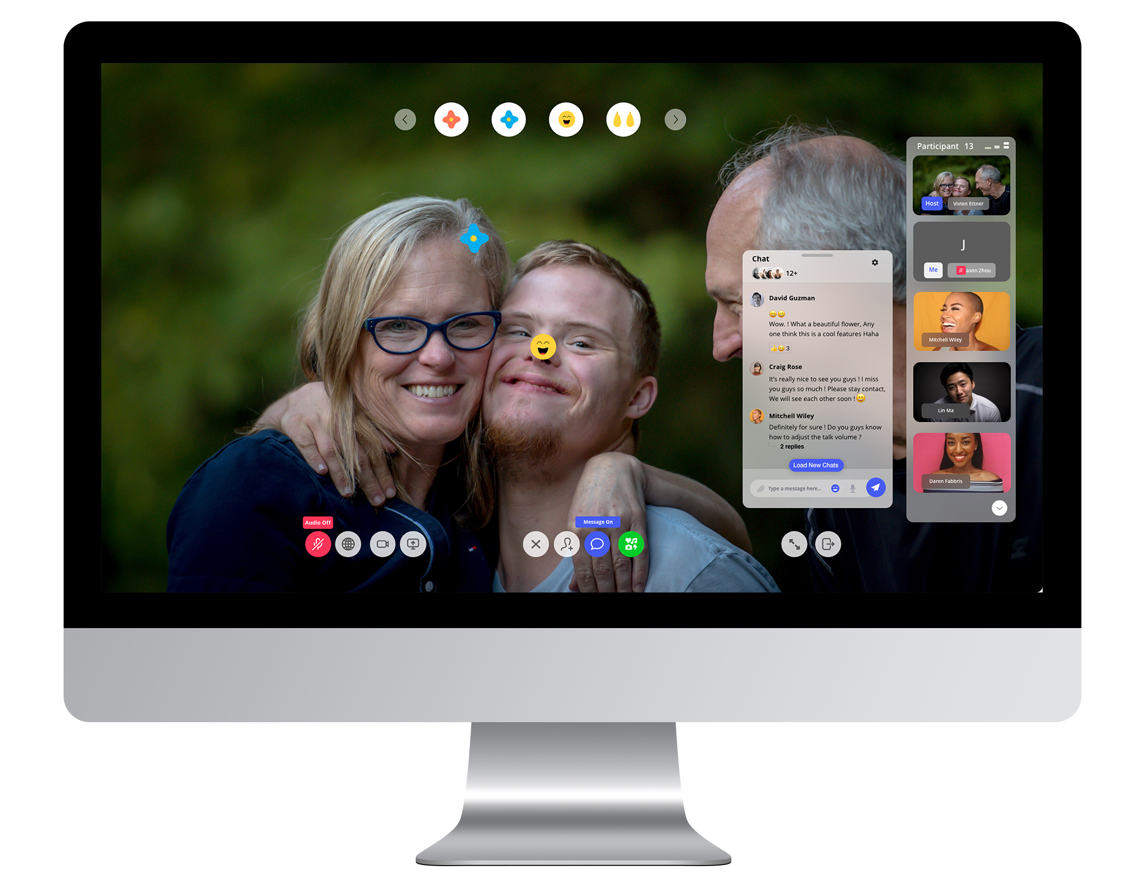

I also came up with excellent accessibility features to allow users to use the meeting feature. First, the captions. The caption is designed for users who have auditory difficulties. Users will be able to read the caption by talking to people without learning sign language. This feature increases the user experience for these users by helping them concentrate better on the content. Second, translation. The translation is designed for people who are not English speakers. Users will be able to use this feature to communicate with the global user in different regions. This feature solved the communication barrier. It provides users more opportunities to expand their connections zone. Third, ARmojie. ARmojie is a great feature to help users create a fun and simple way to interact. It takes advantage of AR technology and allows users to interact with emojis through the video call. Users can drag the emoji to create a fun effect, which may help increase the user experience for those with cognitive disabilities.
Statistics
Statistics is the bold idea that I came up with based on user research. I understand many people need data to help them make a better career decision. Statistics is a cool tool to help them achieve their goal. It’s deeply integrated with user profile data and company data to help users better understand their career situation.
You data only for you
When I designed the statistics feature, I focused on the experience. How might I make data intuitive for users to view and understand? What should the layout be? Customization is key. I designed a simple layout to help users to customize the data they need. For example, users can add or delete the data they need.
Pain Point solved:
Provide user data to help them better understand their career goal. Provide user feedback about their career opportunity.
For employer
The interface for employees will look different from the interface for employers. Employers will be able to review data such as total applications, application received time, etc.


Accessibility Design
Accessibility features design is the most challenging part of this project. I focused on four major categories: Vision, Hearing, Mobility, and Learning through previous research. My ideal accessibility features are integrated deep through the system, allowing users to access those features anywhere and any device.
Vision
I focused on the vision accessibility design at the beginning of this project, researching the best color and contrast for the new system. I learned a lot through the research process. There are three requirements for visual perception: Visual Acuity, Contrast Sensitivity, and Color Perception. Visual acuity is measured by identifying letters or numbers on a standardized eye chart from a specific viewing distance. Contrast sensitivity is your ability to distinguish the foreground from the background. Contrast sensitivity is an essential measure of visual function, especially in situations of low light, fog, or glare, when the contrast between objects and their background often is reduced.
Colorblind Theme
Color blindness—also known as color vision deficiency (CVD)—is a deficiency in distinguishing between different colors. It occurs when light-sensitive tissue in the back of the eye—the retina–fails to adequately respond to variations in wavelengths of light, which enable people to see different colors. There are three distinct types of color blindness: Protanopia (Red/Green Color Blindness), Deuteranopia / Deuteranomaly (“green weakness), Tritanopia (blue weakness). I designed and tested three different themes that work best for those types of colorblindness.
Deuteranopia Simulation

Colorblind mode for Deuteranopia and Protanopia
Protanopia Simulation

Colorblind mode for Tritanopia

Colorblind mode “ON” for Deuteranopia and Protanopia


Colorblind mode “ON” for Tritanopia
Dark Mode
Dark Mode is the trend for all system designs nowadays. I am glad to bring it to OurAbility's new job dashboard. It's thoughtfully designed to make every element on the screen easier on your eyes and is seamlessly integrated throughout the system. It is simple to turn on from the accessibility center or set to follow the time.


Low vision
It’s nearly impossible for low vision users to use the system without zoom in. However, when users zoom in, the block content issue will happen, so I redesigned the layout by increasing the text size and carefully reorganizing some key elements such as text. With the low vision mode, users can easily see the text without zoom in or out. The layout is fully redesigned to support the low vision of people’s ability to use the system better. With the low vision mode, users can easily see the text without zoom in or out. The layout has been fully redesigned to support low vision people better use the system. I believe low vision mode will bring the accessibility experience to the next level.
Low vision’s eye (Before)

Low vision’s eye (After)

Magnifier
The Magnifier tool will make users more comfortable to view the text on display. If a paragraph, caption, or headline is too small to read, hover over it with your cursor and press Command. Users will get a dedicated window with a large, high-resolution version of their selection. Users can even choose the fonts and colors that work the best.


Narrator
The narrator is the feature designed for people who are fully blind. The narrator will read content to users who are not able to see the screen. There are two modes for users to choose: “read option”, “read sections.” If a user decides to read options, the system will learn all buttons or indicators. If users choose to read the section, the system will read whole articles together to help users better undergo the unfamiliar system.


Hearing
Hearing is the second accessibility design area that I focused on. Hearing features inlude such as live caption for video call, voice translation, live chat for video meeting.


Mobility
I designed some powerful assistive technologies into new dashboard systems to give people physical limitations more productive ways, including advanced chatbot integration, voice assistant, and visual keyboard. And a range of settings lets users adjust interaction sensitivities for an experience that works best for them.

Chatbot Integration
Chatbot integration is an important feature that I designed for the new dashboard system. The chatbot was the feature my team and I created for the new OurAbility website, a vast user experience improvement for disabled users. A chatbot can help users add a user profile, change the setting, etc.
Pain Point solved:
Great accessibility tool to help users take actions without manually set up or control.
Voice Assistant
Voice Assistant lets users fully control the system using only their voice. A comprehensive set of commands makes it easy to open and interact with the page they want quickly. Additionally, users can navigate virtually any app by showing numbers that appear alongside clickable items or superimposing a grid to precisely select, zoom, and drag.


Accessibility Keyboard
Users can navigate the system with minimal use of a physical keyboard. The Accessibility Keyboard is a customizable, onscreen keyboard that gives users with limited mobility advanced typing and navigation capabilities. The Accessibility Keyboard has full Dwell support, allowing all of the system features to be used without ever needing to click a mouse button.
Learning & Mental
For the learning and mental disabilities spectrum, I specifically focused on the autism spectrum and mental focus.

Screen narrator ! Read anything to you !
If you learn better when you can hear what you’re reading or writing, the screen narrator feature can help you better understand the content you selected. No matter the small text or long job description, highlight any text and hear it read aloud. You can even adjust the speaking rate.
More detail more for you!
For people who need extra information or clear indication to understand the system, the focus mode will help them better understand what they need. The system will make it clear for them, such as text, button, clickable object, search box, etc. Users never will get confused about the system interface.

Mobile Compatible
Best experience should cross all platform
The mobile experience is always the top part of the overall experience. For mobile experience, I took advantage of the mobile screen size. I redesigned the layout to fit perfectly for the mobile device to provide users with a simple and accessible experience.
The significant differences between web and mobile system interaction are mouse and finger. When using a mouse, users have to hover over the process to feel the system's depth. However, it's not easy for mobile to use our fingers to do that; deep emphasis is what I want to help users achieve. For mobile, I used shadow and blur to express the deep, which indicates user interaction action.

Testing & Iterate
What did users think?
I asked three of my friends to take a quick remote usability testing. I used Zoom to screen mirror and simulate the experience and asked them to think aloud as they used it. Overall, participants loved the new job dashboard's visual appeal, but there are some concerns about the details design and experience. One of the significant issues is how I can make sure the new dashboard works with everyone. I was pretty sure not all the users will like the design or satisfied with all the features that I designed. Through user ability testing, I think customization is necessary for users to have.
Customize Style
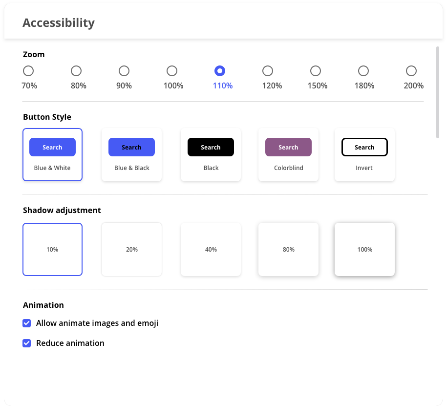
Through the usability test, I understand more about the new user’s experience. I believe customization is essential to have to cover as many users as possible. So I designed customize style features in settings to allow users to customize the style such as button style, which will be the accessibility to the next level experience.
Customize Layout
The customizable layout allows users to add the feature they want or remove the function they don’t need; they always can add the functionality back from setting. This gives the user an excellent opportunity to personalize the dashboard and maximum the user experience.


Redesigned Chatbot Style
I changed the Chatbot style to match the latest iterate design. I believe there still can be improved, and improve never stop.
If I had more time, I would…
1 More usability test, more feedback, iterate
If I had more time, I would run more user-ability tests with the disability community to get more user feedback.
2 Research more about accessibility design.
The most challenging part of this project for me is accessibility design and research. If I had more time, I would get a more in-depth analysis of accessibility. I also want to ask more users who are unable to test the product to make sure everything will run smoothly.
REFLECTION
What did I learn?
1 Technology is most powerful when it empowers everyone.
Nowadays, 1/5 of the Earth population has a disability and experience struggles to have access to the same services and products as people without disabilities have. It’s essential to focus more on accessibility design in the future. Throughout this project, I learned a lot about accessibility design and realized that not all the app and systems provided good user experience for users who have a disability. In the future product design, I will take more thinking about the accessibility aspect, and I believe a good user experience should be designed for everyone.
2 Understood Accessibility design principle
During this project, I have learned a lot about the accessibility design principle, such as using color properly, how to create sufficient contrast between text and its background, etc. Learning accessibility design guidelines helped me better understand how to design the accessibility feature.