

OurAbility Website Redesign
In this project, I led a design team on a complete redesign of the OurAbilty official website, including redesigning information architectural , user flows, content strategy and visual guidelines.

Project overview
In this project, I led a design team on a complete redesign of the OurAbilty official website, including redesigning information architectural , user flows, content strategy and visual guidelines.
Client: Our Ability Inc. is a company which uses the latest AI technology to create accessible and inclusive technology for the employment of people with disabilities. The company enables people with disabilities to Dream a Better Life Through Employment.
Project Role
Lead Product Designer, Information Architecture, sketching, prototyping, Visual design & testing, project management
Tools
Adobe XD, Photoshop, Figma, Team
Kevin Camelo, Vicky Farinango, Aditi Agrawal, Rohit Raghunath Patil, Ishan Samir Parekh, Aishwarya Nitin Pathak, Latefa Mahmoud
Challenge
How might we help users find information they need quickly and accurately?
OurAbility website is the major channel for disability community to empower their employment. OurAbility offer three major service: OurAbility Connect, OurAbility Jobs, and OurAbility Alliance. All three services aim to provide meaningful career connection for people with disabilities. Currently, the website is cumbersome to navigate, overloaded with content, and lack of visual hierarchy, making it difficult for visitors to browse naturally and have to rely heavily on the text. This create a significant barrier in terms of jobs search, building connection, prodcast etc.
Project Process

Empathize
What do we want to achieve? What is the goal of this project?
To make sure we achieve a great web redesign journey, we have decided three major goals that we want to focus on: Improve browsing experience, intuitive design, and great accessibility features.

Research
What we want to achieve ? What is the goal for this project ?
In the beginning, the project requirements was design a Chatbot to improve the experience for people who have a disability. However, after evaluated the current website situation, we made a tough decision to redesign the existing website first in order to fit the chatbot and accessibility feature better. According to our usability tests and site architecture analysis, the previous OurAbility site could be summed up in one word: confusing. This was largely due to the way information was presented, the site architecture, and the multiple targets OurAbility had for clients.


Google Analytics
We conducted an analysis of OurAbility.com to understand user influences, flows, and churn throughout the site. This report is based on user interactions with the website from January 1st, 2019 to December 31st, 2020, which includes 33,988 unique visitors and 69,382 unique page views.

High Exit Rate
Besides the homepage, the most popular page on OurAbility.com is the “Find a Job” button on the homepage with 9,621 unique views. Our analysis shows that once on the jobs page, the exit rate of users on the site is 74.9%. This is concerning, since we assume individuals would be interested in browsing available jobs within the OurAbility jobs portal. 74.9% of those 9,621 visitors left the site after browsing to the jobs portal.
Organic Search
We discovered that most of the sites visitors (52.94%) come from organic search, with the most popular search queries being variants of the search query “NYC PCO exam.” While most visitors are coming organically, they’re coming for the wrong reasons since the PCO exam referral is from a 2017 blog post titled “New York State Professional Career Opportunities Exam.”

Behavioral
Although OurAbility provides employer support through diversity initiatives and training, these pages see a clear lack of interaction. Most of the page views to those pages come from direct search. Behavioral patterns on the website from organic searches are primarily geared towards OurAbility’s job connection services through OurAbility connect.
Problem Statement
Users who visit OurAbiity.com are struggling to understand just what the company does. Is it solely a job finding platform? Is it clear that it is targeted to individuals with disabilities? Our research says otherwise. The platform’s strengths, within its employer and employee services, are lost with poor SEO, poor site architecture, and poor user site flows. How might we design a new landing page, dashboard, and chatbot for OurAbility Inc. to strengthen awareness of the services the company provides, while creating an accessible job seeking experience?
Information Architecture Analysis
After the data analysis, we constructed the information architecture base on the existing website to understand the overall website structure better.

Key Takeaways
1 Current Information Architecture is too complicated to understand.
We found out current IA is not clear enough for users to go through the website. Some link is redundant and misleading users.
2 Some link was missing…
We found some link was missing. This is not good user experience.
3 We don’t know what users and achieve through the current website.
After analysis of the IA, we got confused about how users can do for the website. The current website didn’t present well enough to lead users into their products.
4 Current IA doesn’t provide a good accessibility experience.
Due to the complicated IA, we don’t believe it user friendly for the disability community, especially hard to navigate for users who have a mental disability.
Web Accessibility Analysis
Accessibility allows users of all abilities to understand, use, and enjoy the web. As designers, it is our responsibility to make sure we design in a way that is usable to all users irrespective of their situation, abilities, or context. In order to better design a fully accessibility website, we analysis the current website accessibility condition.


Key takeaways from Web Accessibility study:
1 Current IA is the a big accessibility issues
Unclear navigation and information architecture make users feel lost. Especially hard for users who has cognitive or mental problem to navigate the website.
2 All color meet the accessibility standard
A good news, we found out current website color meet highly accessibility standard. So we took advantage the current website color system and apply to the new design.
3 Backend issues
Although the color contrast meeting the standard, however, we believe there still have some invisible errors on the current website need to be fix.
User interview
We realized that data wouldn’t tell us more insight into what the user’s real feeling about job board. We focus on empathy and stand the user’s perspective to see the problem. We decided to interview some students about what their expectation about the job board. To do that, we decided to interview a few students in SU inclusive U program to ask them about their job search experience.
Goal:
1 Stand in user’s perspective to understand their overall job search experience ?
2 Asked users what they think about current OurAbilty website experience ?
3 Understand user’s pain point. What decreased user’s experience ?
4 Validate hypotheses and generate actionable insights

User Journey map / Cognitive walkthrough
To better understand their perspective about the current website, we conduct a cognitive walkthrough to find out what exact problem is present for the existing OurAbility website. The cognitive walkthrough is a usability evaluation method in which one or more evaluators work through a series of tasks and ask a set of questions from the user’s perspective. The focus of cognitive walkthrough is to understand the system’s learnability for new or infrequent users. A cognitive walkthrough begins by defining the task or tasks that the user would be expected to carry out.


Key Takeaways:
1 Almost 99% of inclusiveU student don’t use job website to find a job.
Through the interview, we have found that almost all inclusive U students don’t use a job website to find a job, rather use relative. Most cannot use the website, and require the help of a mentor to help them use sites. This discovery help us determine what the target user for OurAbility website.
2 Students are tend to focus on connections during this job search process.
We understand students are tend to focus on connection to find job. For example, through relative, family numbers and friends. We believe this is a good phenomenon to take more insight on.
3 Current website make people confused.
when we show current website to our Interviewee, we realized most users get confused about the website layout and features. Most people said the website is little bit overwhelming, the information did not well organized to make user understand.
4 Job apply experience is terrible.
We asked a few students to apply a job in OurAbility website, and got lots of navigation feedback such as accessibility issues, outside applications etc. We understand Job search experience is important for all of us, so we decided to focus on more about job search experience.
Ideate
Brainstorming & Whiteboard Exercice
After the research, we decided to went through a brainstorming session to help us better make a design decision. We did whiteboard exercise to get inspiration from our previous research.


Key takeaways from brainstorming and whiteboard exercise
1 New IA is the key to all redesign.
Through our previous researcher, we believe all-new design should base on the new IA. All the brainstorming ideas were base on how to make sure our unique design ideas fit for the new IA.
2 Need a design system.
We believe a design system is essential to guide designers and engineers to make product consistency. We need to create a design system to help font and back-end engineers implement the new design.
3 Accessibility issues
Through our research, we understand that OurAbility website still have substantial accessibility issues that need to be fixed. Also, we believe that we should start thinking about accessibility feature design base on the new IA
Design Opportunity
After pervious research, we have conclude three design opportunity for New OurAbility website: Reconstruct IA, Create a visual design system, improve accessibility.

Reconstruct IA & Navigation
Based on the core users and their needs, we reorganize the website information, combine the key info, and remove the redundancy info based on business requirements and our previous research. We reduced the top-level IA items from 7 to 6.
Card Sorting
We decided to use close card sorting to help us better build new information architecture. We understood how users would like to categorize content and how they would like to name each category. Based on the findings from card sorting, we re-arranged OurAbility website content, adjust the terminology, and refined the information architecture.

Our goal for the new information architecture is the less, the better. We first organized all current information about the website and recreated the current experience. We realized that there is so much redundancy information on the website that we believe it’s unnecessary to have it.
Result
The previous organization of the OurAbility website was frustrating for our users. In addition to redundancy issues, users noticed that the website failed to clearly describe what OurAbility offers as a service. What is the difference between buttons for “find a job” “join our employers” and “build a profile”? Our users didn’t understand, and we didn’t either.
To fix this, we established a clear information architecture that is based around OurAbility’s core competencies: employer services surrounding disability compliance and job-seeking services that help individuals with disabilities find employment. The homepage now explains both services clearly, and points users to other information based on their interests. This decision was based on the analysis of the site’s analytics, which found that the majority of people who visit are looking for these two services. With fewer pathways, users don’t have to question “Where did I find that information?”
Old IA

New IA


The new information architecture takes advantage of our findings from the analytics report to make some key decisions.
This includes:
- An improved organizational flow that helps users find information quickly.
- An emphasis on the most important features of the OurAbility website according to our analytics report: employer resources and the job portal.
- Less extraneous information that is bad for SEO and screen-reader accessibility.

Visual Design system
The current website doesn’t have a clear visual design system. So we decided to create a design system to help designer and developer use. We organized some important elements from the current website and added more new design elements to the design system.

Concept Sketches
We took the newly defined IA and sketched out screens accordingly. In order to get more inspiration about the design idea, we sketched multiple variation for each scenarios. We got multiple design ideas about home page, search jobs layout, and accessibility tool. We then critiqued these concepts and narrowed down….


Wireframes & Testings
We designed different color contrast and small component such as input bar, job board, etc., to understand how well those e components will fit for the new design. We then created some lo-pi wireframes base on new IA and different scenarios. We also redesigned the accessibility tool base on new style.
Designing for accessibility may be a challenge for companies or some businesses. Still, while it may prove to be more challenging to create a design that accommodates everyone, it is not “impossible.” To test our new design, we conducted a miniature version of usability testing with 6 participants ( 3 for each concept) and asked them to do identical tasks. We designed around two major scenarios ( First Visit, Browse and search jobs, accessibility tool)
SCENARIO 1: First Visit
Test insight: We asked users to compare the new redesign landing page and compare it to the current website. Most users said the new landing page more clean and simple. We believe the new landing page successfully achieved our design goal.
Issues: Users believe the company partnership design can be improved. Participants would love to see more condense design for company partnerships and more info about the company.

SCENARIO 2:Browse and search jobs
Test insight: We are primarily testing the color contrast and how new IA affects the overall experience for job search experience. Overall, users like the new design about the job search page, especially the redesigned elements and components.
Issues: Participants love to see more job info, such as the job filter or job category, to enhance users' experience.
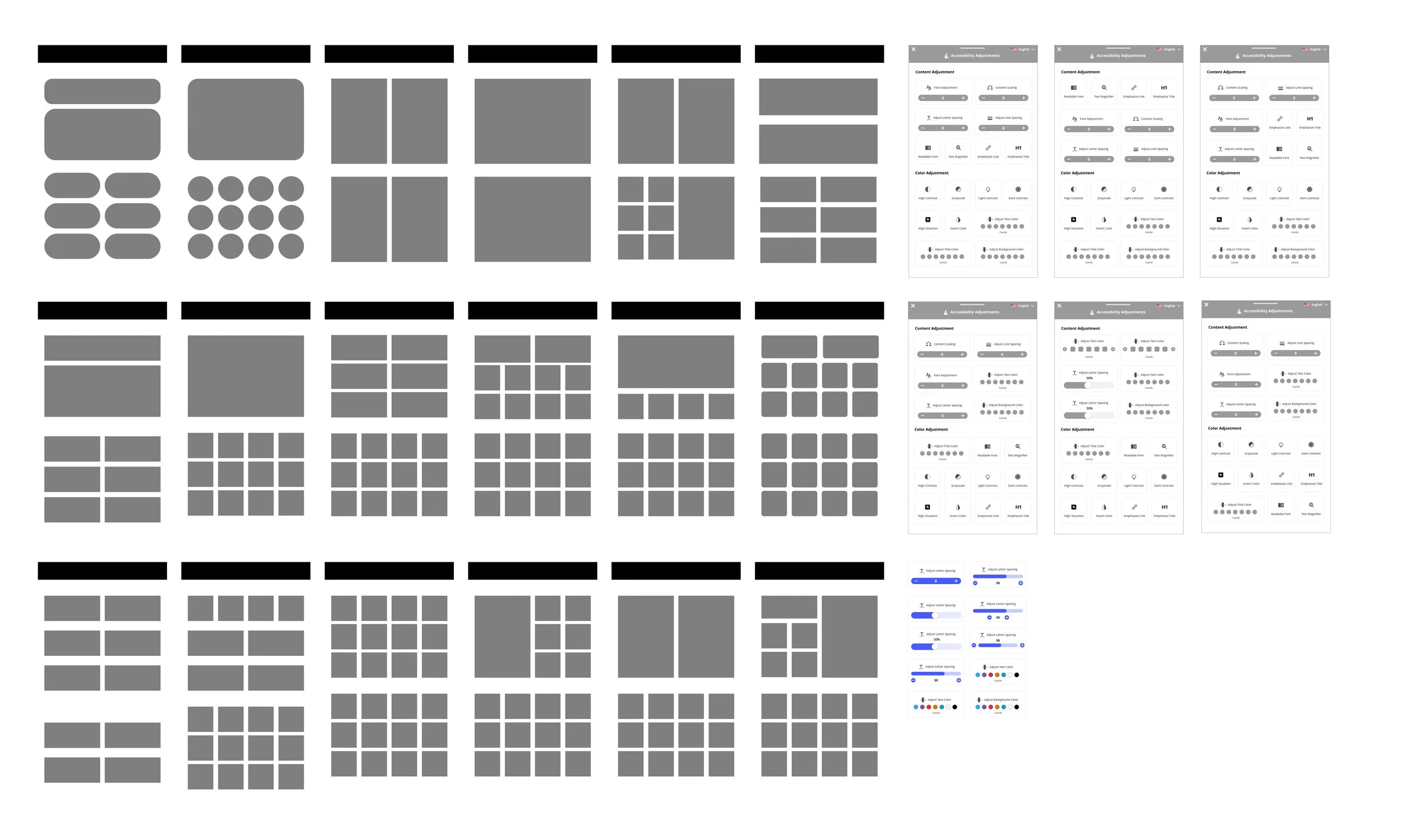
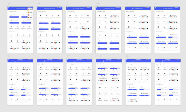
SCENARIO 3:Accessibility Tools testing
Test insight: We redesign accessibility tool by adding the new icon and simulated different scenarios to test how user’s opinion about the new accessibility tool. Most participants like the new design accessibility tool bar. They believe it’s more easier to use than before.
Issues: Participants love to see more feature in accessibility tool. They believe the accessibility tool bar can be bigger for better readability.

Iterate
Through usability testing, we understand how to make our design better. We improved our design and added more elements to make it better.


Key takeaways:
1 New Landing page New lading page design was successfully meet user’s expectation.
However, there are still left some design issues need to be fix, such as need redesign the company partner and information board.
2 Job search experience need improve.
Although, the jobs search experience has been improved a lot. However, uses are expect more feature relate to jobs search experience.
3 Visual Hierarchy
The final UI style should be clean and minimal while following the brand’s image.
4 We had a huge success by redesigning the accessibility tool.
We got lots of user feedback from our participants. We are proud that we made the website more accessible.
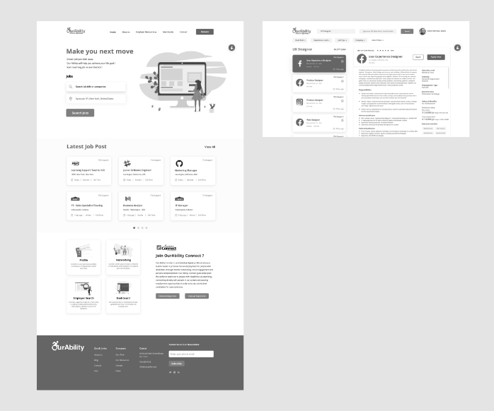
Final Design

The Landing Page

Job Search


New Job Hunting Experience
We think carefully about how the job search experience works. Through previous user research, we understood users want to take minimum effort to maximize their job hunting experience. With the new design page, we redesigned the job info and tab, increased readability for users better to use.
New Information Page
Thanks to the new IA, we would be able to organize the fragmented information and make the page more clean and consistent. With the new OurWork page, we adopted lots of carousel designs in order to reduced information-packed. We combined the original four separate pages to one single information page to help users explore the company resources more efficiently.


New Accessibility Tool
Base on user feedback, we improved the accessibility toolbar. We redesigned the layout base on different functions and user’s behavior analysis. All accessibility tools have been categorized. Users can find what they need more accessible and more straightforward. We believe the new accessibility toolbar will bring accessibility to the next level.
Before

Before

After

After

Iterate 2
In the beginning, our design was base on the current design system. We adopted all the original color and applied to the new web design. However, we believe the color contrast can be better. So, we improved the color and matched the style with the original OurAbility connect dashboard. Please check out the OurAbility Connect Dashboard redesign case study to learn more about it.
Before
After


Mobile Experience
The OurAbility mobile portal is designed to be easily scannable with large action buttons to lead users toward the right location. The site features accessibility-centered features that work in tandem to those already baked into a user’s mobile operating systems. In addition, a sticky navigation bar allows for easier access to navigation-level pages. Copy was changed to be more human-centric, with OurAbility’s core values leading the conversation with users. Compared to the original mobile site, this version is clearer with a main goal: to inform users about the services the organization provides.

Similar to its desktop counterpart, the mobile UI for the OurAbility chatbot feeds into the idea that OurAbility is not only a service, but a companion in a user’s job search. Once a user clicks “let’s chat” they are led into a friendly tutorial of how to use the chatbot service with human- centered prompts. Ovi, the chatbot’s name, eagerly awaits to assist, and has a presence in the bottom right corner of the mobile site. As a result, the chatbot is visible and affords interaction.
Think about Chatbot
Another mission for this project is to design a functional chatbot to help increase users' experience. We believe the new website laid the foundation for the next Chatbot design. Please check out OurAbility Chatbot design to learn more about it.
Reflection
What did I learn from this project?
1 Balancing business and user needs is key to the feature’s success.
We had lots of discussion with OurAbility product team about the design we made. While a new feature may seem desirable to uses, it is essential to phase it in with smaller moves so usability testing can be performed with more specific metrics to assess potential.
2 Learning from each other.
Our design group was diverse include both HCI and non-HCI student. We work closely with the business analysis team. This became an advantage because we had unique ways of working. The non-designer and BA team pushed us to more efficiently not get caught up in the smaller details when our focus should be one the bigger picture.